1/1
Bloomberg Philanthropies Mayors Challenge
With the Bloomberg Philanthropies Mayors Challenge (BPMC), Bloomberg Philanthropies, a philanthropic organization started by Michael Bloomberg, wanted to encourage city governments to develop innovative solutions to major social and economic issues affecting cities and the nation as a whole. All US cities with a population of 30,000 or more were invited to submit innovative ideas that could both improve their residents’ lives and be replicated by other local governments. A total of $9 million would be distributed to five finalist cities to begin implementing their proposals, with $5 million going to the winner and $1 million to each of the four finalists.
Bloomberg Philanthropies approached the design team because it wanted to incorporate a thoughtful empathy-driven approach to the challenge. The goal was to use design to ensure that the Mayors Challenge would be one that city governments could get excited about.
For phase 1, Bloomberg Philanthropies asked the designers to inspire as many mayoral offices as possible to submit high-quality entries. The design team wanted its design to both pique candidates’ interest and keep them engaged throughout the application process, making it simple and clear every step of the way.
A top priority for the launch was to make sure that the entire application process, from the first point of contact to the application itself and the receipt of results, would be intuitive and rewarding for participants. This was particularly important in the context of city government and these kinds of competitions, which have the tendency to be highly laborious and time-consuming to enter—the opposite of innovation.
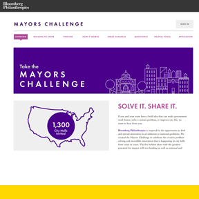
For the direct-mail campaign, which was the first point of contact, designers wanted to intrigue rather than overwhelm city officials. The mailings provided just enough information to spark interest, ask for RSVPs and invite potential applicants to learn more at the BPMC website, http://mayorschallenge.bloomberg.org. Designers kept the website simple, using bold, intuitive graphics and concise, conversational language; they also offered multiple channels of information (such as videos, links, examples of urban innovation, a timeline, FAQs). They designed tools, like an idea tip sheet and a rationale tool, to help applicants work through their vision and proposals, asking them to think about how their ideas could be implemented, how powerful their impact might be and how easily they could be replicated. Perhaps most importantly, the application itself was only 24 questions long, relatively few for a prize of up to $5 million. The inaugural BPMC got a great response: 305 high-quality applications from all over the country.
During Phase 2, the designers were tasked with creating a document that would share innovative ideas from local governments across the country, both to thank all participating mayoral offices and to encourage them to continue developing bold solutions, regardless of the competition outcome. They combed through all 305 applications to uncover the most interesting and relevant information, identified five patterns and trends in urban innovation, and distilled what they learned into a 75-page booklet entitled “Big Patterns and Bold Ideas.” This booklet served as an inspiring nationwide expression of innovation in city government and also built on the momentum of the BPMC’s first year. The design of the document was focused on keeping the design clean and simple, using clear visuals and small chunks of easily digestible text. The booklet received enthusiastic feedback from participants.
发布于2019-11-29
设计奖项
美国IDEA工业设计奖
Gold/金奖
2013 年
颜色

