1/1
Samsung OLED TV Logo
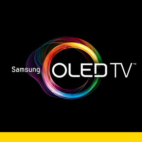
The Samsung OLED TV Logo was designed to communicate a sense of life and vitality, which reflect the characteristics of organic light-emitting diodes (OLED): the new frontier of smart TVs. For many years TV has been dumb. Unlike phones, which have become highly intelligent, TVs have not evolved to the same degree. Samsung’s new OLED TV is so smart that it understands its users. It recognizes people’s voices and senses their gestures, making changing the channel and accessing other functions natural and intuitive. It also learns what users like to watch and makes personalized recommendations, helping people discover new shows.
The Samsung OLED TV Logo features a transparent and flexible form that is made to look like it’s a living organism, much like the television it represents.
The O was adopted as the design motif, and a multitude of colors were chosen to express a hue circle of the three primary colors of light (red, green and blue, or RGB). Within the O shape, dynamic lines were adopted to create vibrant light. The form itself is a transparent, organic-looking shape with a naturally occurring piling of layers. This look reflects a design that appears as thought it is moving.
The concept behind the logo is a living organism full of abundant energy reflected in light. Although the O shape of the logo is borrowed from the word “organic” in “OLED,” it was also inspired by the word “originality” as a representation of the ultimate in originality that Samsung has created. The shape of the O is rendered in a nonstandardized flexible form: The O cannot be contained to one perfect circle; rather parts of the O (light strips) bend away as if the logo were breathing. The logo’s characteristics are visually emphasized to communicate that the product is representative of the OLED TV that is ushering in a new concept for a TV, user interface and design.
In principle, the O is used in combination with the words “OLED TV,” but can be used alone as a single O for greater visual impact. Breaking away from the previous standardized logo form, the O can be trimmed and distorted, and diverse, lively images can be created according to the color zone used.
发布于2019-11-29
设计奖项
美国IDEA工业设计奖
Gold/金奖
2013 年
颜色

