1/12
Spending more time on-screen? This premium Android Launcher makes your smartphone less addictive
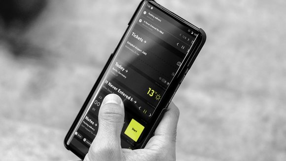
Blloc rose to fame in 2018 following the launch of its smartphone, a capable piece of tech that did something no other phone dared to attempt. The Blloc smartphone came with hardware and software that provided complete functionality, but with the intent to curb screen addiction. The Blloc smartphone used a clever OS-skin that unlocked the full potential of the device, but made it in a way that didn’t distract you with vibrant colors, notification dots, banners, vibrations, buzzes, or any extraneous features that made you want to use the phone beyond what was needed. The minimal UI sported a classy monochrome palette, letting you view information without being attracted to it. The smartphone seemed to be quite a success as the guys at Blloc managed to sell out their entire smartphone inventory… but that was just an ambitious beginning. With its latest offering, Ratio, Blloc brings its original distraction-free UI to other Android handsets. The Ratio launcher works just the way an Android launcher does… but rather than just making cosmetic changes to the home screen, Ratio gives your Android UI a complete minimal makeover. In short, it takes Android’s Material Design and makes it, well, less materialistic.
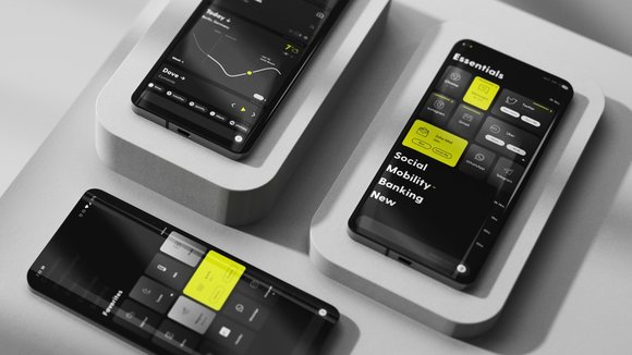
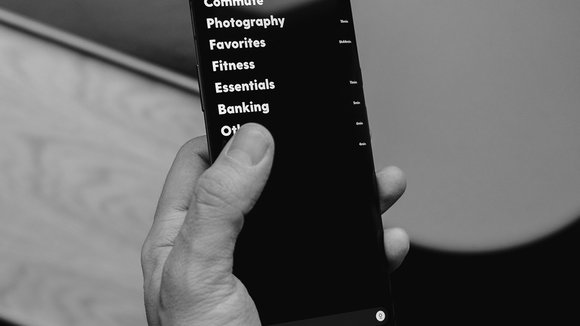
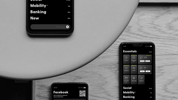
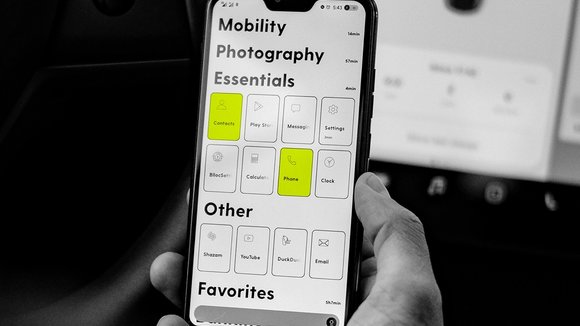
Call it serendipity, or a conscious and determined effort on the part of the Blloc team, but the Ratio comes at a perfect time when smartphone usage is at an all-time high. Once you install the Ratio launcher (which is available for free), your home screen gets replaced by Ratio’s clean UI that segregates your installed apps into ‘blocks’. The interface comes in dark-mode, with white and yellow assets against a black background for better contrast and a noticeably longer battery life. Conversely, there’s a Sun-Mode too, that flips the UI to black assets on white, a feature that’s useful for better visibility outdoors. Upon installation, the launcher unclutters Android’s home screen of icons by creating a category or block-based system that lets you segregate and organize apps. Each category and app-tile lets you know, right off the bat, how much time you’ve spent within it, so you’re more aware of your app use (or overuse). Ratio’s UI doesn’t just put a black and white filter over the home screen. You can take individual apps and turn them monochrome too. Apps like Facebook and Twitter seem instantly less addictive when they’re in black and white (you’re more likely to browse a color magazine than a black and white newspaper, right?), and this neat trick instantly helps you blacklist and whitelist (get the wordplay?) apps based on your frequency of usage.
Swipe to the left of the home screen and Ratio comes with its own version of Google or Apple’s card-based landing page. Ratio fills this dedicated page with applets or widgets which you can customize based on need. You’ve got widgets for weather, mail, travel, news, and even a Spotify widget that lets you play music without accessing the app. It’s a clever approach that allows you to access features within individual apps without needing to open them. This way, Ratio gives you the functionality you’re looking for, but without any of the distracting dark design patterns and elements. If I were to look for an analogy, Ratio is like a fruit platter that provides you with the sustenance and nourishment you need without the sugar addiction that you’d get with Android’s KitKat, Lollypop, Marshmallow, Nougat, Oreo and Pie OS versions.
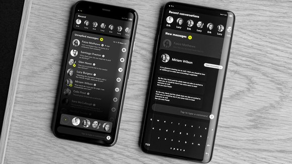
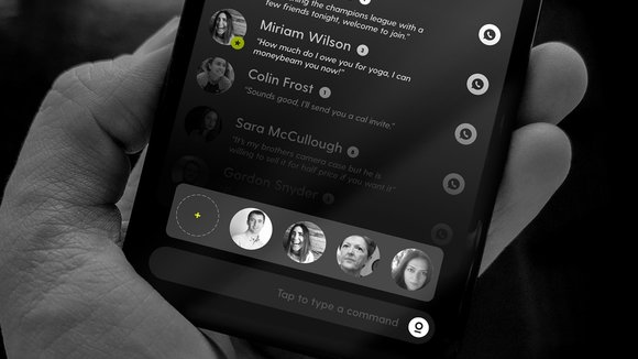
Another key area of intervention on Blloc’s part lies to the right of its home screen, with an experimental chat page that combines chatboxes from all your social apps in one single page. The idea is to enable communication, but to do so without needing you to open a chat app or a social app. With Blloc’s chat page, all your recent chatboxes appear in one screen, allowing you to reply to messages within the OS, without opening any app.
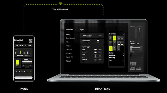
The cherry, however, on the Ratio fruit platter is its desktop companion, Blloc Desk – which initially lets you install Ratio on your phone, but later creates a desktop-mirror of your phone, allowing you to transfer media between your phone and PC or Mac wirelessly, access files, edit calendar events or notes, and clear up space on your phone if you’re running short on space. The syncing between the desktop and phone is virtually instantaneous and lives up to Blloc’s promise of distraction-free functionality and productivity. Based out of Berlin, the Blloc team’s currently rolled out Ratio for OnePlus and Google Pixel’s latest models, with support for more Android devices, and even iPhones coming soon. The launcher, which is available for free, comes at a perfect time when an entire generation of people are trying to adjust between being productive while working from home, and being sucked into social media apps and their addictive-by-design interfaces. While it seems unlikely that Apple, Google, Facebook, and other companies will do anything to make their digital products less addictive, it’s good to know that the guys at Blloc are operating on a digital-wellbeing-driven ethos that’s actually human-centric.
Designer: Blloc
Ratio is Latin for ‘system’ and very appropriate for this Android Launcher. It has no excess, no clutter, no distractions. Every element on Ratio is purposeful and intended to help you retrieve the information you need, so you can get back to real life.
Streamlined interactions to reduce screen time. Ethical design sits at the forefront of the software because smartphones should be a humane and helpful tool, not an addictive playground.
A clean and simple way to store your apps. To maintain a stress-free and minimal environment, tuck your Tiles in customizable drawers. Easily expand all your drawers or close them in one swipe.
Your new and improved app icon. Tiles give you enhanced functionality and design to your apps. Highlight apps you are using the most, mute apps you find distracting, or lock the ones holding sensitive information. Increase their size or hide apps completely for privacy.
Understand how you consume your device. Unlike other launcher that tuck your usage and health insights deep in their settings, Ratio puts it right in front of your eyes.
Vital services accessible with one tap. Avoid going into apps and access the news, weather, music, timer, blogs, RSS feeds, and more from your Root page. Every time you click on a service it appears on your Root as a card.
Save time and pin cards you use most. Certain apps or services you use often? Pin them so they stick to your Root and are even easier to access.
Tips that adapt to you. To increase productivity, view suggestions for all services based on your most actively used apps.
Be connected, not consumed. Instead of switching between apps, you swipe between people. Access all your conversations in one place. Read and write in one screen across all platforms.
Star your most active contacts to easily access their conversations. Simply toggle to your Favorites list to connect with your close circle.
Monochrome to color in seconds. Although we love B&W, we also greatly appreciate color. Swipe your finger from the bottom corners of your device to switch between color modes.
Ease your eyes on a bright day. To offer better readability in environments with a lot of light, select ‘Sun Mode’ to switch the UI of your device to a white background.
Take a break from your phone by synchronizing your data across all devices. Your information always stays secure and private on local devices using your home or office Wi-Fi.
发布于2020-10-22
设计师
Blloc
颜色
相关推荐
