1/6
After the MotoRAZR 2019, the Revolve concept hopes to revive the Motorola Aura
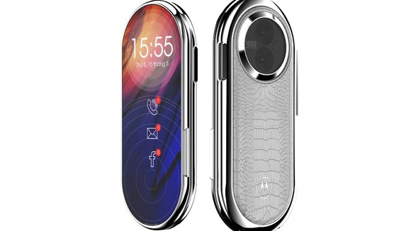
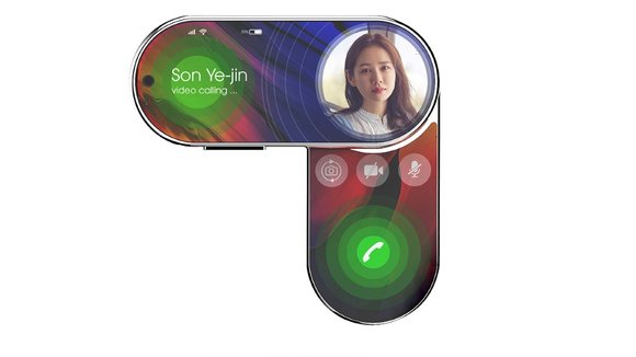
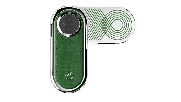
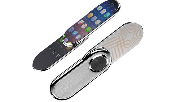
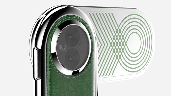
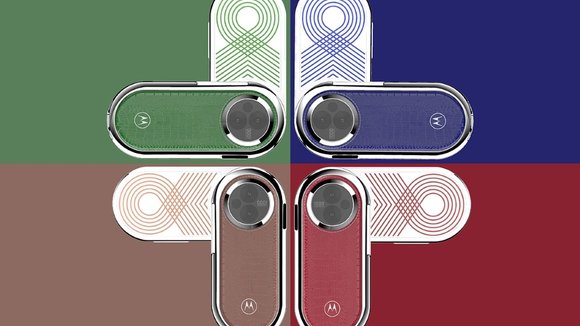
I’m here to make the case for weird, capsule-shaped smartphones because I’m frankly tired of how exhaustingly similar smartphones of today look like… especially the mid-range ones who’s only USP seems to be a moderate price tag. Here’s a phone that Carota Design created just on a whim based on a very whacky Motorola Aura phone that debuted nearly 12 years ago. The Aura sported a circular screen, a revolving front, and a strange camera cutout at the back. The conceptual Motorola Revolve follows pretty much the same format, but ditches the circular screen and keyboard for two rather oddly shaped (but definitely feasible) flexible OLED touchscreen displays.
Its iconic whacky shape is perhaps what I feel the mid-range smartphone market needs. The Revolve is clearly not a flagship. You couldn’t possibly browse the internet effectively on it or watch a Netflix movie on a screen with such massively rounded corners. You could, however, craft a budget UI that uses and respects the capsule-shaped screen well, just like how smartwatches with circular screens have a bespoke UI. You could use this UI to provide basic features like video calling, Facebook browsing, messaging, and a pretty capable voice assistant, while essentially offering it as one of the most radically different budget-phones on the market. It wouldn’t require any over-engineering either, like those expensive folding smartphones. Besides, a leather finish on the back and a dual rear-camera setup makes the Motorola Revolve concept hella interesting, from all angles!
Designer: Carota Design
发布于2020-10-22
设计师
Carota Design
颜色
相关推荐
