1/9
The Cubic Wireless Mouse ditches ergonomics for visual appeal
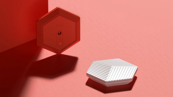
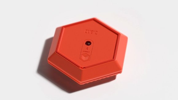
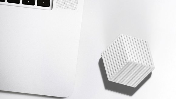
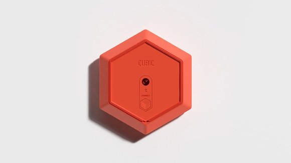
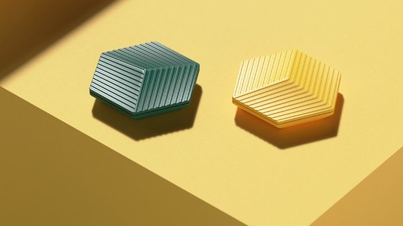
Shattering the mouse-design-archetype in glorious fashion, the Cubic mouse takes on a less ergonomics-driven design approach and a more, dare I say, cubist one. The Cubic Wireless Mouse concept (yes it’s a concept and not a real one, so calm down) comes with a hexagonal design and uses bright colors… something you’d agree most mice don’t really do. Rather than being designed as a peripheral for your computer, the Cubic Mouse takes on the appearance of a jewel that you’d be proud to keep on your desk.
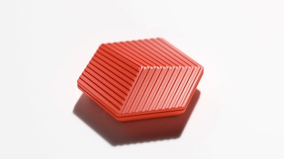
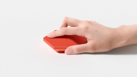
Its symmetric design would confuse you regarding basic stuff like button placement, but that’s where the Cubic Mouse uses design details efficiently. With a 3D pattern on the top, the mouse cleverly tells you how to use it. The buttons lie right under the majority of lines pointing in the same direction, divided equally between the left and right-click. It isn’t as intuitive as you’d think, but it does achieve its goal to be a mouse that challenges the rules of computer peripheral design. The Cubic Mouse is designed to be something that your eyes and hands almost gravitate towards, and if you’re a bit of a design purist, you’d argue that it isn’t ergonomic enough; but hey. It’s just a concept… and a pretty beautiful one too!
Designer:
发布于2020-10-22
设计师
Kim Hyunsoec
颜色
相关推荐
