1/9
From dropping the beat to dropping the heat!
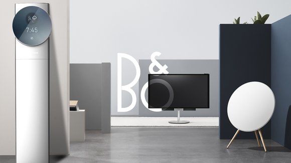
From what I reckon, Bang and Olufsen are doing pretty well for themselves in the Hi-fi audio business. I wouldn’t imagine them expanding their product range for business purposes any time soon, but it costs nothing to wonder, does it? What if B&O made air conditioners? Luckily for me, someone already asked themselves that question and embarked on a journey to envision what a B&O AC would look like.
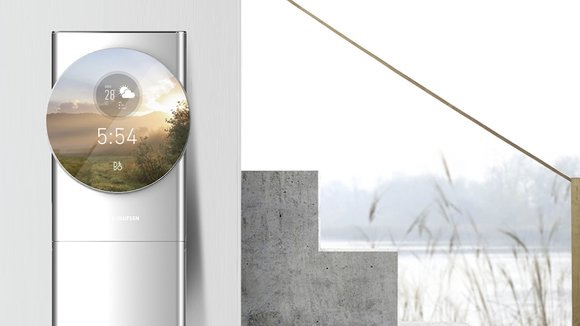
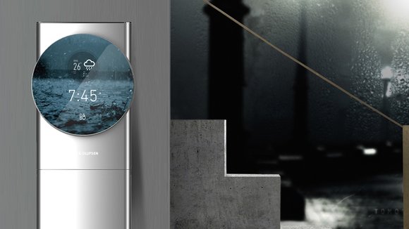
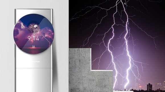
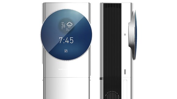
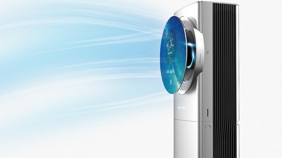
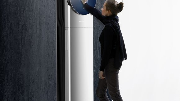
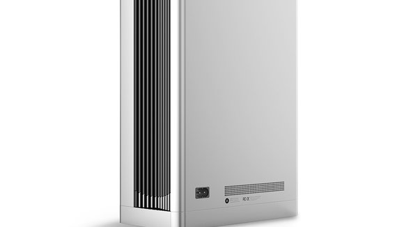
The best way to describe the concept design is grand. Seamlessly capturing Bang and Olufsen’s signature ‘boolean’ style, the AC makes use of bold geometric shapes with a larger-than-life outlook. The display for instance is much bigger than necessary, but that’s how B&O roll! The circular display not only showcases relevant product information, it also gives a visual indication of the weather forecast, something pretty neat, because in an air-conditioned environment, it’s pretty difficult to tell what the actual weather is like. Full marks for nailing the design language, but extra marks for the additional user experience!
Designer: Lim Hymnbook
发布于2020-10-23
设计师
Lim Hymnbook
颜色
相关推荐
