1/2
AC Orange Rebranding
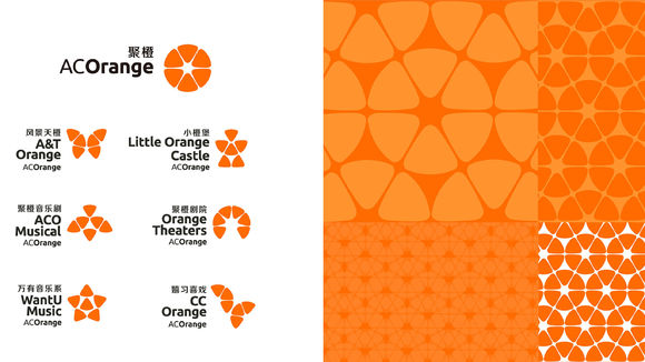
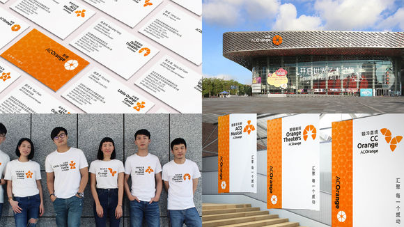
AC Orange has become the only platform that integrates the entire performing arts industry chain in China. AC Orange strives to bring maximum exposure to each performance so audiences can immerse themselves in the beauty of the arts and broaden their aesthetic perspective. The AC Orange logo is made up of six orange segments forming the shape of an orange, signifying the integration and reorganization of AC Orange’s diverse selection of moving art performances. The white star at the center of the logo signifies the emotional response sparked by the performance.
发布于2020-11-26
设计公司
Ogilvy
设计师
Chyi Lin (ECD), Mila Yeh (ACD), Karen Hsieh (SAD)
设计奖项
德国iF设计奖
iF DESIGN AWARD/iF设计奖
2020 年
颜色
相关推荐
