1/2
Redesign Rotstift AG
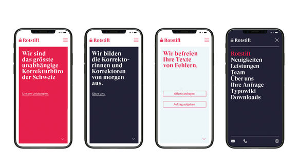
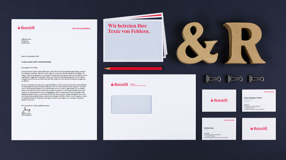
Anyone writing or publishing in Switzerland knows Rotstift AG – and has thus probably learned a lot about orthography, grammar, and punctuation. In close cooperation with the client, SUAN reworked the brand strategy and sharpened the brand value. On this basis, a branding was developed that vaults Rotstift into the digital age. The display font GT Super is made for Rotstift and underlines the digital aspect as well as the company's long tradition. In all communications, a fresh red shade combined with two secondary colors is used. That way, color and typography alone create a corporate identity that provides the long-established company with a new charisma.
发布于2020-11-26
设计公司
SUAN Conceptual Design
设计师
Susanne Hartmann
André Konrad
Déborah Mayer
设计奖项
德国iF设计奖
iF DESIGN AWARD/iF设计奖
2020 年
颜色
相关推荐
