1/2
SCHWARZROTGOLD
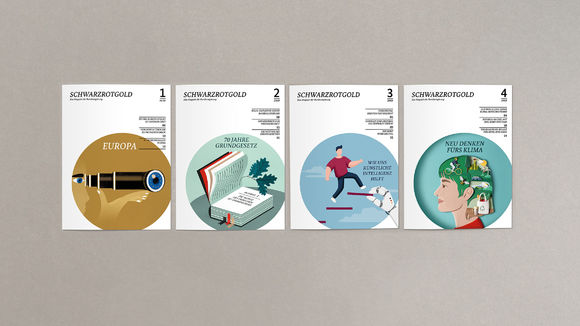
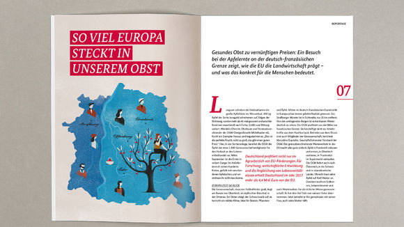
The idea behind the design was to create a clear, tidy layout that provides quick access to the content and guides the reader. An open type area and a high degree of whitespace removes first-reading hurdles. Proximity was a design principle. The use of illustrations breaks through the objective distance and sometimes exaggerates ironically. Recurring design elements create a consistent impression, although the use of color and structure consciously focuses on a playful variance. Each issue works with a different illustrator, who is selected to match the respective guiding theme.
发布于2020-11-26
设计公司
zum goldenen hirschen berlin gmbh
设计奖项
德国iF设计奖
iF DESIGN AWARD/iF设计奖
2020 年
颜色


