1/1
Forge Ahead
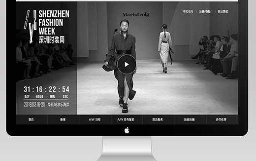
To promote Shenzhen Fashion Week, the design team provided a full range of brand services, including a comprehensive brand visual management system that covers print, video, website, print, and environmental. The visual management system compiled and consolidated information, unified the main tones and styles, and managed a series of materials to faithfully present the brand strategy and personalities. The overall tone capitalized on the soul Shenzhen as a young, stylish international city. As part of the initiative, the design team designed a font with 26 letters, numbers, and commonly used punctuation marks. The font is tall, slender, elegant, and beautiful. It looks like a model. The font set was inspired by logo design and can be independently applied within the overall image system.
发布于2020-12-16
设计师
SenseTeam for Shenzhen Fashion Week
设计奖项
美国IDEA工业设计奖
Gold/金奖
2020 年
颜色

