1/2
Fortnum & Mason Teas
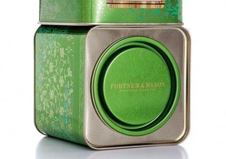
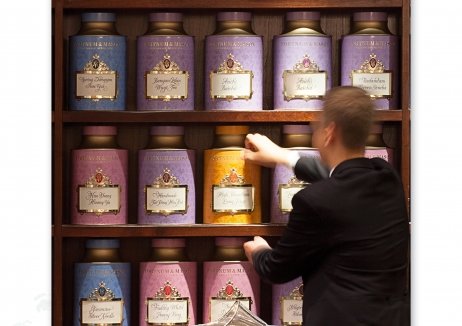
London specialist food store Fortnum & Mason were looking to reconfirm their brand as a leading seller of speciality teas. A complete overhaul of the packaging of around 150 premium tea blends was undertaken, with Fortnum & Mason’s 300+ year heritage leading the new approach. The packaging needed to reflect the Englishness of the famous brand, effectively communicate the differentiation of the range, improve shopability and also create a sense of ‘theatre’ at the flagship Piccadilly store.
The redesign helped to communicate the client’s eminent status both in-store and online, with sales volume increasing dramatically as a result.
The new packaging stimulated an average overall 103% increase in total like-for-like range volume sales, and a return on design investment was seen within only six months. Additionally, individual ranges such as ‘Famous Teas’ rose by 41% and the ‘Rose Pouchong’ blend soared by 1240%.
发布于2019-12-23
设计师
DECIDE & Peter Windett Associates
设计奖项
英国DBA设计奖
Gold/金奖
2015 年
颜色


