1/3
Heath & Heather
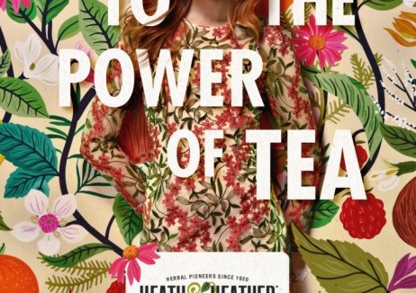
Heath & Heather’s refreshing new look breathed life into the struggling herbal and fruit tea brand and sales leaped 22% on the previous year.
Having been pioneers of herbal teas since the 1920s, by 2015 Heath & Heather was failing to ride the wave of popularity in this area and its market share was shrinking.
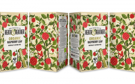
A new pack design and visual identity by This Way Up Creative, re-ignited its appeal with consumers and retail buyers. Listings in Ocado, Morrisons, Tesco and Waitrose were secured, and the brand reached 150,000 new households, with 50% of this growth incremental to the category.
In reconnecting Heath & Heather to its heritage, the new premium positioning and design enabled the brand to drive up its price per kilo by 48% in the year after relaunch.
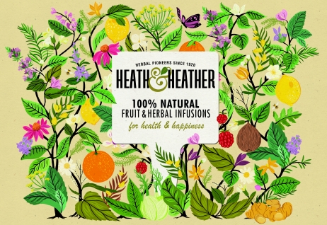
The recyclable pack’s ‘Seed Tag’ brand device aids range navigation, and its background illustration captures the botanical expertise of the founders whilst also creating a striking ‘hedgerow’ effect on shelf, with the illustrations connecting to each other.
Eye-catching, authentically English and contemporary in style, the memorable look has also helped Heath & Heather grow its exports by 48%.
发布于2019-12-23
设计师
This Way Up Creative
设计奖项
英国DBA设计奖
Bronze/铜奖
2020 年
颜色


