1/3
Danerolles
With improved shelf presence and increased awareness of its range, fresh dough brand Danerolles rose from decline to grow market share year-on-year following the launch of its bold, new design by Design Bridge.
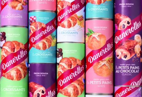
Once a beloved brand, Danerolles was looking dated and was struggling to maintain share and relevance amidst copy-cat competitors. With a weak shelf presence and little differentiation between SKUs, consumers were generally only aware of the brand’s croissants offer.
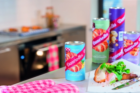
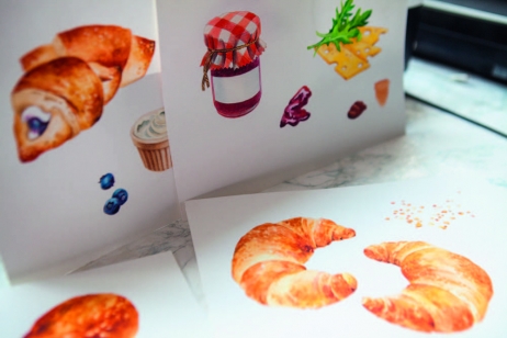
A revamped identity aligned to food enjoyment revived Danerolles following its launch in 2017. The unique ‘twisting’ wordmark, bold colours and product illustrations have differentiated Danerolles from competitors and improved visibility of the entire range; by 2019 brand awareness had grown 10% in the Netherlands, to an all-time high.
With Danerolles’ SKUs easier to navigate, complaints about incorrect product purchases dropped and sales rose across the range. Retailer trust in the brand returned, leading to distribution of three niche SKUs doubling in the Netherlands, with penetration up from 35% to 75%.
Danerolles has been able to shift from a croissant brand to a brand offering several meal solutions, with new products such as pizza dough successfully launched. Danerolles has also been able to extend into new international markets, reducing its dependence on its home market.
发布于2019-12-23
设计师
Design Bridge
设计奖项
英国DBA设计奖
Bronze/铜奖
2020 年
颜色


