1/2
Carling
Carling, the UK’s number one lager, was facing major challenges. Competition from premium craft beers and imported lagers was growing significantly, whilst alcohol consumption was falling. The mainstream lager category was in decline with sales down 11% since 2011 and along the way, in a bid to fit in with trends, Carling had lost its personality and standout.
Things looked bleak until a dynamic redesign enabled Carling to buck the category trend and achieve substantial growth.
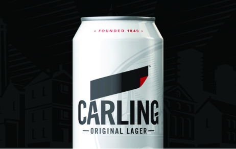
Carling’s famous ‘black label’ was reimagined and elevated to proud icon for the brand. A Masterbrand strategy applied confidently across the Carling family has united the previously fragmented portfolio. The new design, which celebrates the brand’s heritage and provenance, has re-established Carling as Britain’s favourite lager.
Since the redesign launched in 2017, Carling has experienced two years of consistent growth, outpacing the market and flourishing behind the bar and on supermarket shelves, shifting an extra 565,000 litres. Without any above the line support, Carling’s sales have grown to £350 million (adding £30 million (+8.7%)) whilst its key competitors’ sales have fallen.
发布于2019-12-23
设计师
BrandOpus
设计奖项
英国DBA设计奖
Bronze/铜奖
2019 年
颜色


