1/3
One Stop
The convenience shopping landscape has changed significantly over recent years including a shift in consumers’ mind-set around own label.
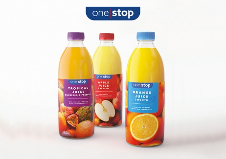
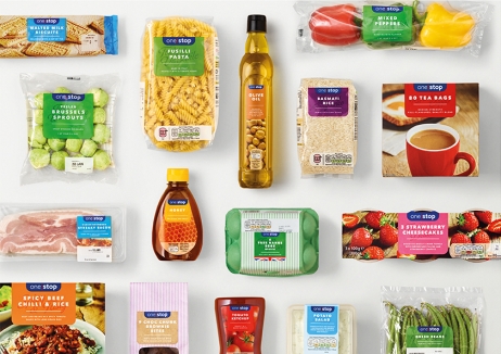
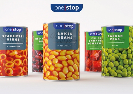
Convenience store operator, One Stop found customers no longer wanted to see a ‘value’ looking own label. They wanted to see a quality offer at a good price, but its own brand packaging wasn’t communicating this. To change perception and increase customer loyalty, One Stop revamped its own label offer and overhauled the brand.
The new brand architecture and packaging design work consistently, yet flexibly across all products. The range is now easily recognisable and navigable and the simplified, vibrant colour palette and photography communicate quality and freshness, transforming customer perceptions.
The new own-label range boosted like-for-like sales by 5%, with One Stop’s pre-tax profit increasing 6.9% on the previous year. Customer perception around ‘fresh quality’ increased by +7 percentage points and the average weight of purchase increased 8% in the first year after the redesign, outperforming the market by 4.5 percentage points. Initially launched across 350 lines, the visual language is now used across the store environment and beyond.
发布于2019-12-23
设计师
Cowan London
设计奖项
英国DBA设计奖
Bronze/铜奖
2019 年
颜色


