1/3
Warner Edwards Gin
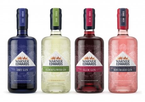
Facing an onslaught of competition and the threat of category slow down, Warner Edwards recognised the brand design of its gin was letting it down. In order to cut through the competition and justify its super premium price point, a redesign was needed.
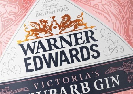
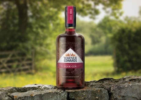
To drive brand growth and appeal to both older ‘at home’ gin drinkers and younger, image-led consumers, every detail of the branding and packaging were carefully handcrafted to reflect the quality and luxury of the gin product itself – from the logo, fonts and colours, through to etchings, bottle shape, finishes and ingredient illustrations – and it’s captured the imagination of consumers in both the on and off trade in the two years since redesign.
Against a contracting market in which hundreds of players are competing, Warner Edwards produced and sold almost 1% of the UK’s gin consumption in 2017. On trade sales value is 76% higher than objective, having grown 1500% since pre-redesign. Listings have soared 115%, double the target, and it is now the number one branded gin at M&S and was Waitrose’s most successful craft gin launch ever.
发布于2019-12-23
设计师
Biles Hendry
设计奖项
英国DBA设计奖
Silver/银奖
2019 年
颜色


