1/5
MOMA
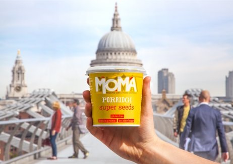
Breakfast brand MOMA has come a long way since it started life at Waterloo station in 2006. But a decade after launch, a shift from the original sales outlets in bustling commuter train stations towards retail sales, necessitated a change in strategy to create an engaging and distinctive design on shelf.
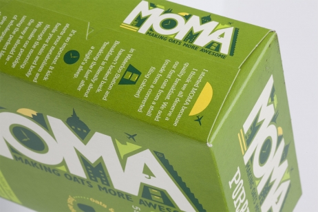
Creating a story behind the name with an ownable strapline – Making Oats More Awesome – while emphasising the brand’s urban heritage, the new identity delivers the idea of a ‘jam packed city’. The product is naturally crammed with healthy ingredients and neatly dovetails with consumers’ jam packed lifestyle – and journey to work.
MOMA has captured the imagination and market for inspiring breakfasts, gaining listings in major supermarkets. With the brand redesign helping deliver a 72% growth in year-on-year sales, brand awareness in the anchor London & South East region is up 15%, and 36% of sales are incremental to the hot cereals category.
发布于2019-12-23
设计师
BrandOpus
设计奖项
英国DBA设计奖
Silver/银奖
2017 年
颜色


