1/3
Carlsberg: a story of brand reinvigoration
Carlsberg was having an identity crisis. Millennials knew the beer for its humorous advertising but little else and gross profits had been declining for four years.
With a shrinking lager market and a rise in discerning drinkers searching for premium alternatives, Carlsberg was losing its position at the bar and on the shelf. Something needed to be done to reinvigorate the brand – to win back the hearts and minds of drinkers, retailers and Carlsberg’s own people.
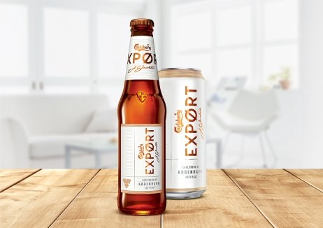
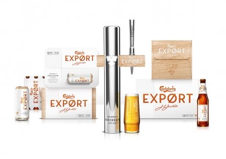
With a new proposition and a Scandinavian inspired design that oozed style and focussed on the brand’s Danish roots, Carlsberg Export gained a premium, contemporary feel, which transformed its outlook.
Before the new visual identity, Export had 3,240 distribution points in Grocery customers – this jumped to over 9,000, a 170% increase. It even gained a place on Sainsbury’s shelves having been delisted for five years. These big wins, including being relisted in Waitrose, have helped not only stabilise gross profit, they have since grown by 2% on every Hectolitre sold and a wider halo effect is being felt by the Carlsberg brand.
And all of this happened before any other supporting comms aired and within a remarkably short period of time – only 14 weeks after relaunch.
发布于2019-12-23
设计师
Taxi Studio
设计奖项
英国DBA设计奖
Gold/金奖
2018 年
颜色


