1/3
The Tofoo Company
R & R Tofu was an experienced player, but they needed a brand identity to realise their ambition of becoming the number one tofu brand in the UK.
Wanting to reinvent the way customers look at tofu, it was essential that their authenticity remained at the core of their proposition. They also wanted to get across their key USP – the delicious taste – something that tofu isn’t usually recognised for.
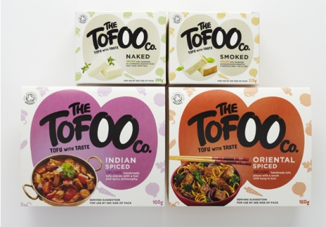
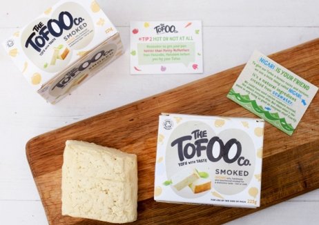
Following an unapologetically straightforward theme, a laidback, playful and confident brand was created – one that would appeal to the young, affluent families market they were targeting. It consisted of a vegetable background, paint-brush typography and a new name with a re-spell of tofu, providing the double ‘o’ that acts as a voice identity across their marketing.
In less than a year of being in the market, The Tofoo Company is delivering to 5,000 distribution points. Engaging both flexitarians and non-meat eaters, production is up 500%, and today you’ll find Tofoo sold in Tesco, Ocado, Waitrose and Sainsbury’s stores.
发布于2019-12-23
设计师
Stormbrands
设计奖项
英国DBA设计奖
Silver/银奖
2018 年
颜色


