1/3
Billington's Redesign
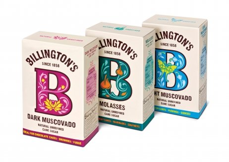
Anonymous on the shelf and with a low consumer profile, Billington’s unrefined brown sugar was an exceptional product being undercut by established white sugar brands extending into the sector.
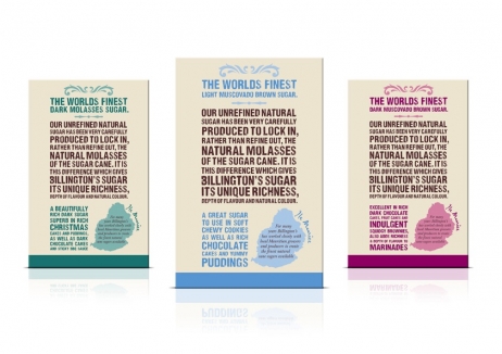
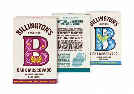
Billington’s decided to invest in design with the intention of bringing the brand to life, reflecting the exciting experience customers have baking a cake. The stripped back design highlights the naturalness of the product and the eye-catching packaging has dramatically increased awareness.
Falling sales have reversed, allowing Billington’s to hold its place in a declining market. Despite operating at a price disadvantage, Billington’s value share of the market has decreased just 0.1% as white sugar competitors entered the speciality brown sector.
The new design has opened up fresh opportunities, with new listings in major retailers including Waitrose. Awareness is up from 26% to 55% and the average purchase weight is up 9%. The return on design investment is estimated to be £24 for every £1 spent.
发布于2019-12-23
设计师
jones knowles ritchie
设计奖项
英国DBA设计奖
Silver/银奖
2015 年
颜色


