1/5
TIGI XMAS 2014
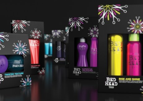
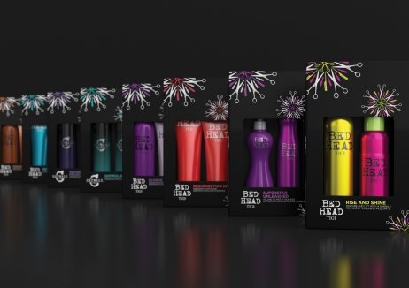
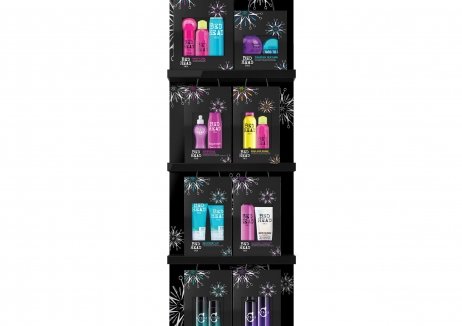
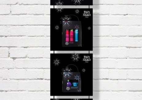
Premium hair care brand TIGI wanted to create something unique in the hugely competitive festive packaging market and set about developing new visual identity, packaging and an in-store visibility system for its 2014 Christmas campaign.
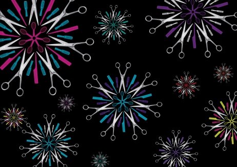
Incorporating an iconic snowflake, which consisted of pieced together hairstylists’ tools, the Christmas campaign surpassed all expectations, delivering an increase in sales eight times more than the brand had experienced in previous years. What's more, the choice of materials and formats enabled the range to present a sophisticated, more premium look and feel, but with a 12% decreased spend per unit in packaging production costs, allowing the brand to improve margins without compromising quality. In testament to the strength of its design, this was the first time the US, TIGI’s No 1 market, chose to follow the Global Christmas design instead of operating independently, thereby creating one powerful global offering.
发布于2019-12-23
设计师
Casa Rex
设计奖项
英国DBA设计奖
Bronze/铜奖
2016 年
颜色
