1/4
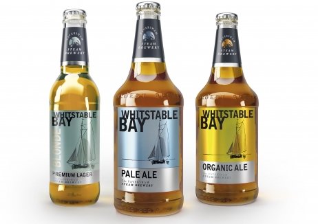
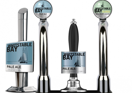
Whitstable Bay Redesign
Britain's oldest brewery took the decision to redesign their Whitstable Bay brand, which had been launched in 2003 and was in need of development. Key aims were to retain the premium nature of the brand whilst moving it to a more contemporary positioning to increase volume growth which had been falling, and to recruit younger drinkers in their 20’s, 30’s and 40’s.
The clean and fresh new designs sit comfortably in restaurant, bar and pub environments and are also available in the off trade. Market distribution has increased post redesign and Whitstable Bay is now supplied to China, Hong Kong, Mexico and Italy. It is also served in Wetherspoons, reaching a much younger demographic and in a growing market, the brand's volume sales still managed to massively outperform the market average. Off the back of its success, a Whitstable Bay Black brand extension was launched.
发布于2019-12-23
设计师
JDO
设计奖项
英国DBA设计奖
Bronze/铜奖
2016 年
颜色
相关推荐


