1/3
Perry Court Crisps
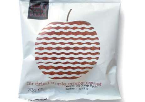
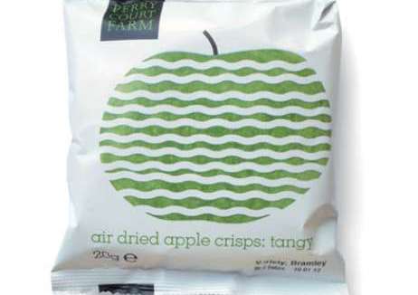
Perry Court fruit crisps was a very good product with unhelpful packaging – despite being the perfect natural snack food, the packaging suggested a poor quality synthetic product. Studio 176 was brought in to overhaul the look of the product and reposition the brand.
The redesign from Studio 176 was simple, modern and appropriate with information radically simplified.The graphic device of sliced fruit with a straightforward description gave Perry Court stand-out, even in the highly competitive crisp market.
Since launch of the new design, Perry Court products have been stocked in Fortnum & Mason and Whole Foods, and in Planet Organic the three varieties are in the top 17 sellers. With pack dimensions 20% smaller, the product can now be stocked in school vending machines where they can compete against junk food monopolies. There was a 150% increase in sales two months from launch and after 14 months they began exporting to 15 countries, rather than simply the domestic market.
发布于2019-12-23
设计师
Studio 176
设计奖项
英国DBA设计奖
Gold/金奖
2013 年
颜色


