1/5
Swan
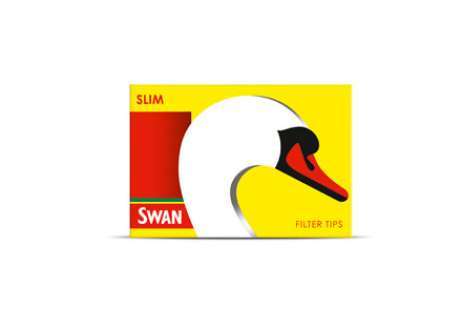
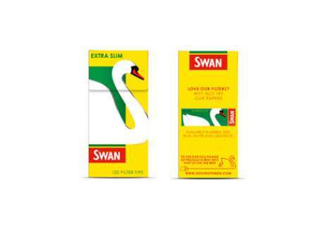
JKR were asked to create a fresh look to help Swan defend its market share through a redesign of its product packaging. The aim was to get Swan’s roll-your-own cigarette papers noticed on fixtures by creating a more engaging and contemporary design.
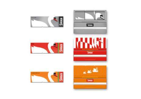
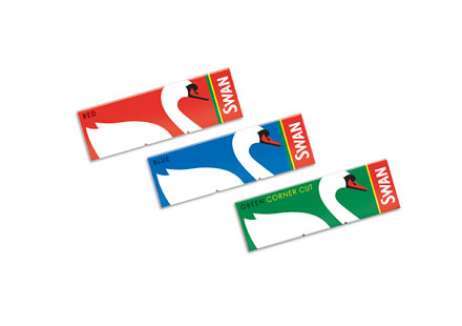
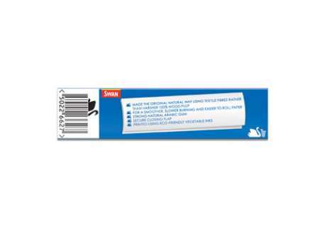
The redesign steered away from the large logotype of market leader Rizla and created a powerful pictogram – the image of a swan, which could be seen easily even on a crowded fixture. Fresh, bright colours were then used to differentiate the various paper sizes and weights, with attention paid to minor details like the inner flapand the reverse of the packets.
In the 12 months since going into store, sales of the redesigned packets have risen by five times the growth rate of the previous year. The results of the redesign exceeded expectation by improving confidence among the sales force, and earning new distribution with wholesalers and display with retailers.
发布于2019-12-23
设计师
jones knowles ritchie
设计奖项
英国DBA设计奖
Gold/金奖
2013 年
颜色
