1/3
AEG Powertools rebrand
TTI is a global leader in consumer and professional products for the home improvement and construction industries. In 2008 the AEG brand was in trouble with declining sales and listings. It was clear that if action wasn’t taken, the brand was dead in the water.
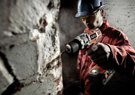
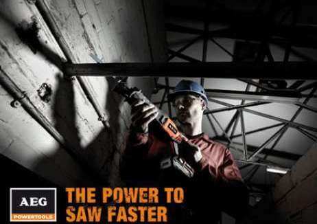
Good were approached to re-position and rebrand AEG’s powertool offering. By uncovering the rich history behind AEG, changing a primary brand colour from blue to orange, and taking ownership of the word POWERTOOLS, they built a comprehensive set of guidelines and introduced new type faces, brand photography and POWER driven language.
Demonstrating how a simple design strategy, when based on sound insight, can be effective, Good has helped a brand close to extinction become a global success in 24 months. The AEG brand saw a 54% increase in sales between 2009 and 2011 and a 0.67% increase in market share in the launch year.
发布于2019-12-23
设计师
Good
设计奖项
英国DBA设计奖
Silver/银奖
2013 年
颜色


