1/5
Okell's Brewery
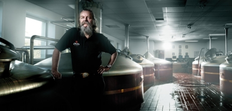
Okell’s Brewery was established on the Isle of Man in 1850, but the identities of the individual ales were developed individually - with no thought on brand. This resulted in a collection of outdated, ‘homespun’ badges that only appealed to real ale specialists. The brand also needed to increase their relevance to a younger audience of drinkers without alienating the existing older customer base.
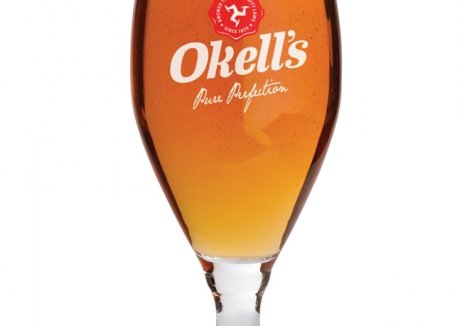
Good were brought in to rebrand and repackage the Okell’s range, unifying the range of ales under the Manx triskelion. The design was also flexible enough to incorporate distinguishing colours and typefaces. A new strapline, ‘Pure Perfection’, emphasised the quality created by more demanding brewing laws on the island.
In the 18 weeks following the relaunch, Okell’s Brewery saw a 48% return on investment and a 25% increase in the number of pints sold year-on-year. The brand also outperformed the market by 23%.
发布于2019-12-23
设计师
Good
设计奖项
英国DBA设计奖
Silver/银奖
2014 年
颜色


