1/4
Anto'
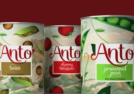
Anto’ is a traditional Italian canned food brand, launched in 2011. The economic downturn in Europe pushed consumers towards canned and preserved food products, but this also meant more competition for the new, small company. They lacked a distinctive identity, and needed to strongly convey the quality and originality of their products as this was important to their target market.
Casa Rex updated the brand’s logo and packaging, using a new colour palette and a calligraphic signature on cans. The new look blends traditional aspects with a contemporary design, capturing the spirit of the brand’s Neapolitan heritage as well as the premium quality.
The rebrand has seen overwhelmingly positive results, to the extent that some consumers are keeping their cans as collector’s items. Anto’ as a brand is now clearly differentiated from its competitors, and has seen a 25% increase in sales and 20% growth in market distribution.
发布于2019-12-23
设计师
Casa Rex
设计奖项
英国DBA设计奖
Bronze/铜奖
2014 年
颜色


