1/5
Twinings Infusions
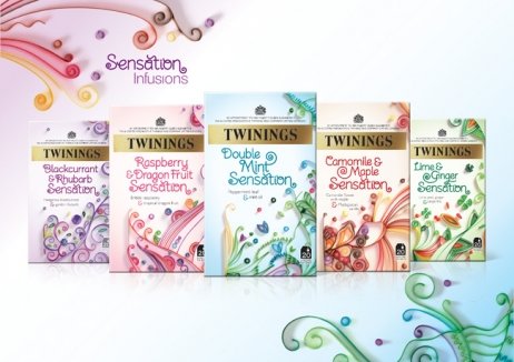
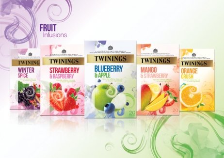
Twinings’ wide portfolio of quality infusion tea blends felt confusing and seemed to recede on shelves. The brand needed fresh design to clarify the different ranges and reaffirm their premium position in the market.
Restructuring of the brand’s portfolio was carried out by BrandOpus, transforming the fragmented Infusions range of more than 40 products into one that was easy to navigate. A simpler, more impactful pack style visually segmented the teas by colour as well as naming, and gave Twinings a more relevant premium look.
The Twinings Infusions range has seen a 22% increase in volume sales, and tellingly both value and volume sales growth have grown at the same time. Sales of the Sensations sub-range in particular exceeded annual forecasts in just eight months, delivering £1.4m in retail value. 60% of growth in the entire category can be attributed to the Twinings brand.
发布于2019-12-23
设计师
BrandOpus
设计奖项
英国DBA设计奖
Bronze/铜奖
2014 年
颜色


