1/6
The only thing I absolutely hate about the Google Pixel 6 is how ugly its cases are going to be…
The Google Pixel 6 is coming; and with it, a barrage of hideous cases that completely destroy its beautiful aesthetic… because of that camera bump.
Roughly a month ago,
claimed he had credible information regarding how the upcoming Google Pixel 6 would look. The
showed a radical new design that had a pretty standout visual detail – an elongated camera bump that covered the entire phone’s width… it was less of a bump and more of a ‘bumper’. My own personal feelings on the design were mixed, although I have to admit it was refreshing to see Google investing effort into its Pixel range after an extremely lackluster performance last year. I am, however, having second thoughts after seeing some concerning smartphone-case designs appearing on websites like Alibaba as we slowly approach the Pixel 6’s launch. Let’s dive in.
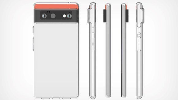
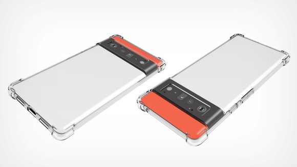
You see, that camera belt may be a design feature, but it’s also a major design flaw once you consider that most smartphone users would end up buying protective cases to shield their expensive smartphones from damage. The benefit with almost every existing smartphone camera bump is that the extruded bump exists INSIDE its body, so when case-designers make cases, the simple solution of navigating around the smartphone’s camera bump is to create a cutout around it. The case has a rather manageable hole that the camera peeks through, sort of like a ski-mask. That, however, isn’t possible with the Pixel 6… A look at the image below should explain why.
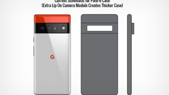
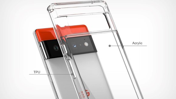
The fact that the Pixel 6’s camera module extends all the way from the left to the right makes it very difficult to create one single cutout. If one were to simply go about creating a camera hole, it would just cut right through the case, separating it into two parts that are barely connected together near the middle. The case then becomes a merely decorative product that simply protects the edges of the smartphone, providing no physical cover/shield for the cameras, which in the case of the Pixel 6, are dangerously exposed. The only way to really overcome this problem and make a proper case would be to design OVER the phone’s wide camera bump, adding another 1-2 millimeters to it and making the bump EVEN LARGER. The cutout would then exist only around the lenses and not the bump itself… as you can see in the image below.
This ‘technical’ solution spells disaster for the Pixel 6’s aesthetics. It exaggerates the phone’s elongated camera bump, turning an elegant detail into an ugly caricature… and the minute you choose an opaque cover over a transparent one, it practically conceals every element of the Pixel 6’s design, making it look like “just another phone”, albeit with a monstrous bump around its camera, thus exposing a major flaw in Google’s design approach to the Pixel 6 – that smartphone designs exist in a bubble where phone-makers expect you to NOT put protective cases on expensive and fragile gadgets. Not Okay, Google.
Images via: Alibaba
发布于2021-08-17
相关推荐


