1/14
This Apple Power Mac series’ modern redesign matches Tim cook’s vision!
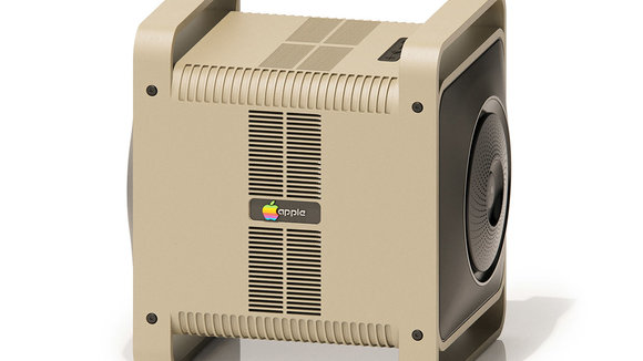
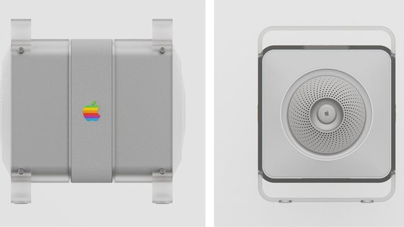
The Apple 3 was unsuccessful probably because it was designed in the early days of the company by the core team. Taking such a huge leap was big risk and according to Steve Wozniak, it was the reason for the failure. Nonetheless, this piece of machinery was pivotal in phasing out Apple 2. Ayush revives the old memories with his Concept One PC that looks modern but still has that age-old Mac charm to it.
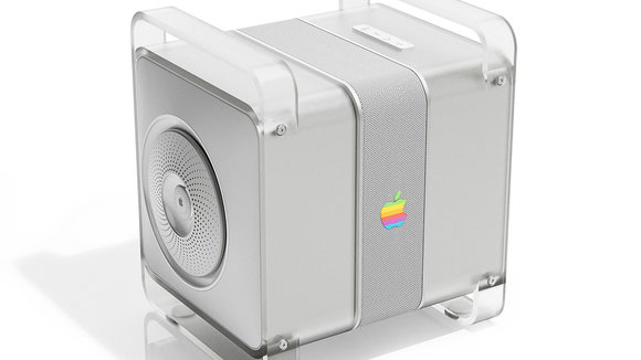
Concept 2 by the designer takes inspiration from the Power Mac G4 which saw a major redesign and aesthetics. This modern take on the G4 is dominated by the translucent plastic having a minty blue color in an aluminum shell that’s so modern Apple-like.
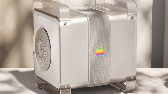
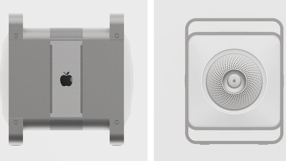
Then comes the elegantly designed Power Mac G5 which surprised everyone with an anodized aluminum alloy enclosure. At that time, the PC looked absolute charmer, and now this modern inspiration for Concept 3 pushes the allure a notch higher.
The official end to the Power Macintosh line came at the 2006 Worldwide Developers Conference, where Phil Schiller introduced its replacement, the Mac Pro. The G5’s enclosure design was retained for the Mac Pro and continued to be used for seven more years, making it among the longest-lived designs in Apple’s history. Given Apple’s Spring Event 2021 and the launch of
in seven color options tells us that Tim Cook is looking at the past to inspire the future. As trendsetters, Apple brought white and silver minimalism to a world saturated with colors to stand out. They are reversing the trend now and going by those standards, maybe the Power Mac gets a second life. If Tim Cook is listening, can we bring the iPod Classic back in a different format now? I could do with a notification-free option to enjoy a gadget!
Look at more renders by Ayush Singh Patel of the HomePod Max series, which has Apple’s legacy stamped worldwide!
Designer: Ayush Singh Patel
发布于2021-08-17
设计师
Ayush Singh Patel
相关推荐

