1/21
Innovative smartwatch designs that are the perfect culmination of form, functionality and style: Part 2
I love a good smartwatch, as do many of us. One of the most fascinating facts about smartwatches is, that we use them for everything other than telling the time! They go beyond simply telling the time, these multifunctional timepieces can now keep a check on our health, update us on the weather, function as an alarm clock, give reminders, cater to the blind, and even function as a case for your Airpods?! Designers are coming up with smartwatches that not only provide perfect form and functionality but also manage to look super smart when we wear them. The options are endless, so to help you pick a smartwatch that works best for you, we’ve curated a collection of innovative and cutting-edge smartwatches that will cater to everyone’s unique time-telling needs and requirements, and also totally deserve to be on your wrists. Enjoy!
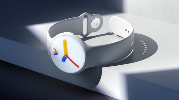
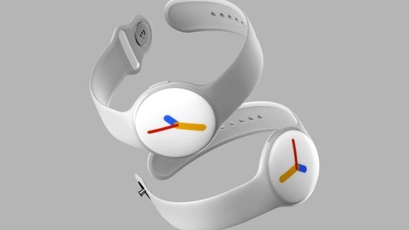
Embodying Google’s playful-serious aesthetic, the
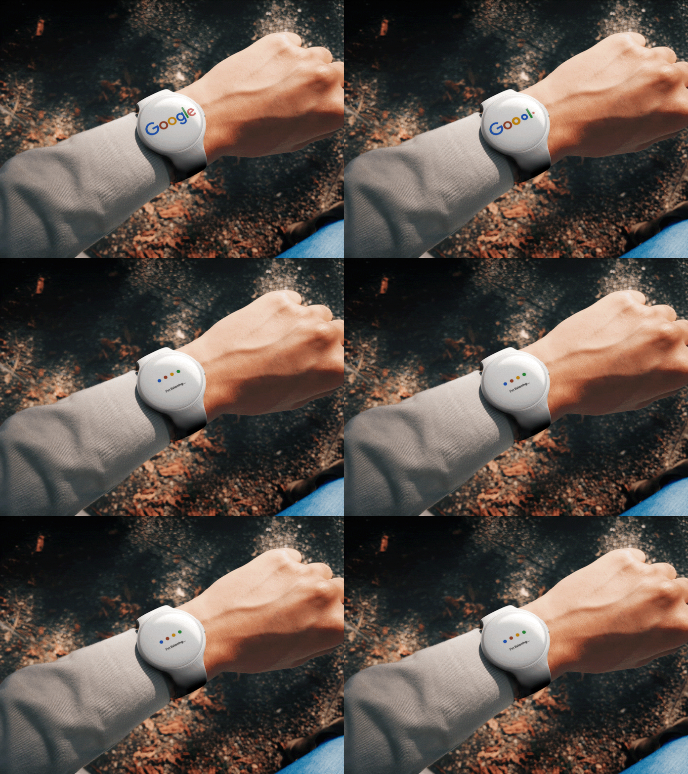
comes in a traditional round format, and in a variety of quirkily named colors. The Android Wear OS logo displays clearly on the always-on display of the watch, transforming into a colorful set of watch hands every time you look at it to read the time. The watch comes with Google’s top-notch voice AI, all of Google’s native apps, and a heart-rate monitor on the back, which ties in well with Google’s plan of acquiring Fitbit and their entire fitness-tech ecosystem. I wouldn’t be surprised if this wearable concept were entirely waterproof too, just to fire shots at Apple!
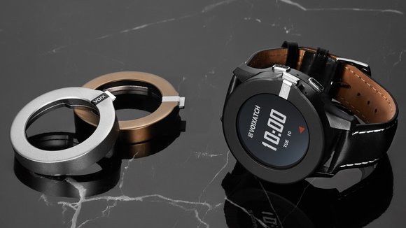
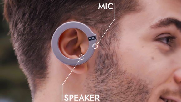
made waves on the tech circuits especially after a demonstration at the Mobile World Congress last year. Grabbing eyes as the first smartwatch with a built-in Bluetooth headset, the VOIXATCH helped unveil a world where watch and earphones were part of a tight ecosystem as one single product that did practically everything your phone could, without you needing to take your phone out. The VOIXATCH smartwatch comes equipped with LTE and GPS, has its own SIM card slot, a Google voice assistant, a heartbeat sensor, a gyroscope, and a battery life of 48 hours. That, however, isn’t the most impressive bit about the VOIXATCH, because embedded within its bezel is a detachable ring that turns into a Bluetooth headset.
Introducing their own interpretation of
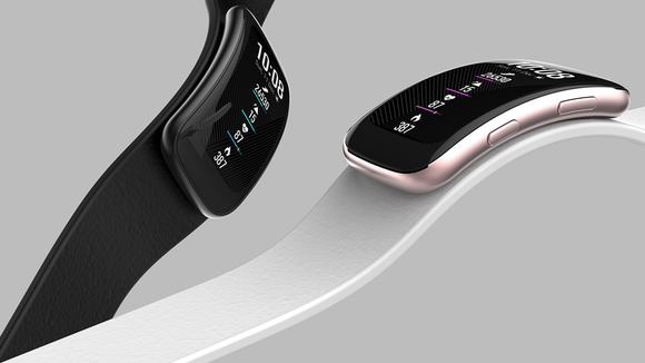
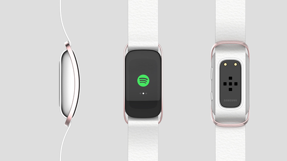
, a California-based group of designers completely redesigned the electronic company’s smartwatch with a new display screen and watch bands. Opting for a tank case shape for their smartwatch reinterpretation, the team of California-based designers equipped Samsung’s Galaxy smartwatch with a curved, vertical display panel. Curved monitors are quickly taking over flat screens with a deeper immersive viewing experience and fuller screen with more vibrant colors and graphics. The team then conceptualized nine different ideations for their smartwatch straps, since the functionality of a smartwatch relies on customizing its watch bands. With nine lives, the detachable watch face would theoretically be attached to the different watch straps utilizing a lock-in-place method. Each rectangular watch face locks into the different watch bands by either sliding into laser-cut, metal incisions, or slipping into adhesive silicone slots.
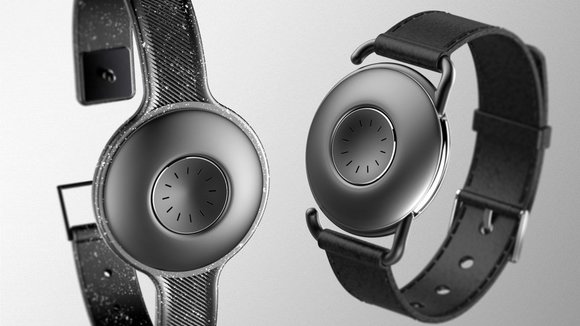
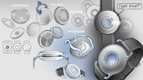
is a smartwatch with a difference; as opposed to relying on a distracting display to communicate information, it uses a combination of sound and light to create a productivity-inducing accessory! Simply put, this smartwatch conveys all the information you need without any screen. The removal of the conventional interface leads to a beautifully simplistic and fuss-free aesthetic that is far less visually intrusive than the devices we are currently familiar with. However, at this point, you may be wondering what Di-fuse can be used for? Well, this wrist-worn accessory is still capable of notifying the user of social-related notifications, tracking their health status, as well as even being able to provide them with direction via voice cues. To elevate the watches desirability even further, it also features interchangeable lugs that the face satisfyingly snaps into, dramatically changes the visual aesthetic of this intriguing device!
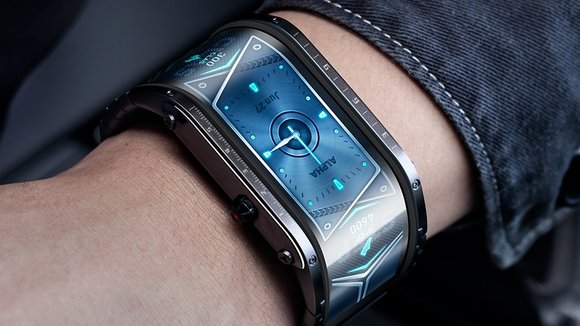
is to smart-watches what the plus-sized displays are to smartphones. The watch comes with an impressive 4-inch display that wraps around the upper half of your wrist, giving the Nubia the largest display on a smart wearable BY FAR. Designed to help lay the information out in a way that’s easy to see no matter the angle, Nubia’s vertical display is instantly eye-catching and is conveniently long enough so that you don’t need to scroll away on a tiny screen. It comes with a real-time heart-rate tracker, 4 dedicated sports/fitness tracking modes, the ability to accept and reject calls, find your phone if it gets lost, and summon your phone’s native voice assistant.
A few weeks ago, I covered a
concept that gave users the option to disconnect from the internet. In a similar vein, the
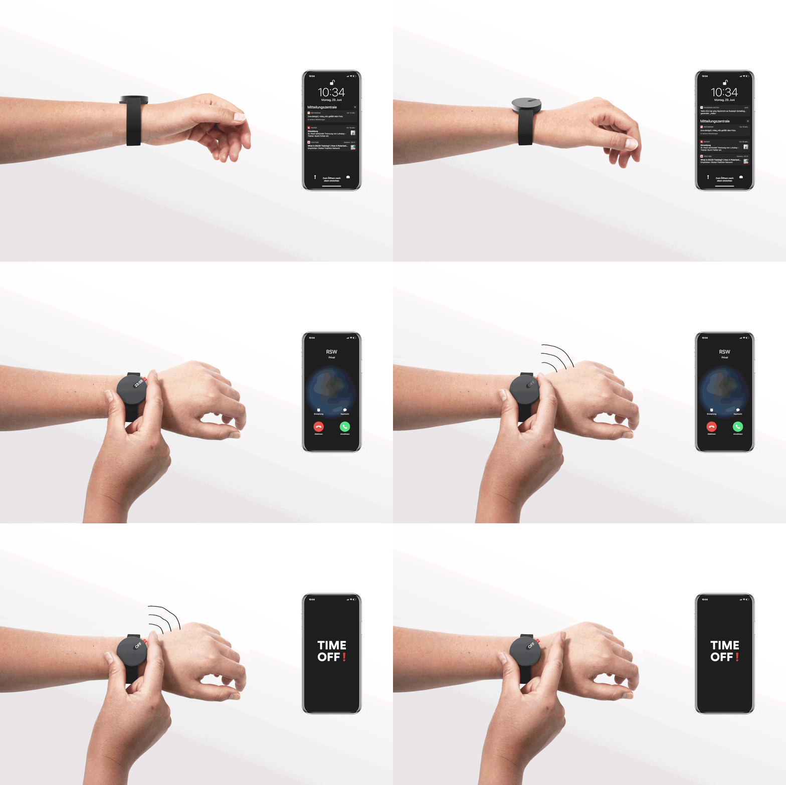
gives you the ability to mute your smartphone notifications. How does it work? Well, the process is pretty straight-forward. Similar to many smartwatches and Fitbits, the TIME OFF! has a companion app where you can control all the settings. With the app, you can choose which apps and alarms to mute during your “time off” mode. Once you save those settings, you can, at any point, silence those alerts by pressing the red button on your TIME OFF! watch. You don’t even have to pick up your phone. My favorite aspect of the watch is its simple design. Yanko has featured plenty of
, but this one is the most minimal watch that I’ve seen. The watch consists of a solid-colored band and a face with a small LED sliver that displays the time. The screen doesn’t even fill the entire watch surface!
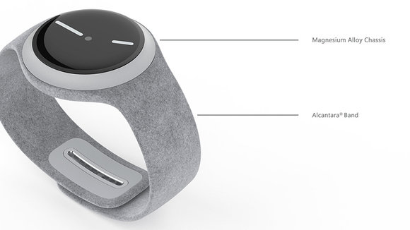
We have designer Reiten Cheng who has developed a
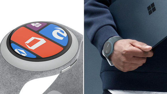
which goes with the design language of Microsoft’s latest line of products. Reiten has boldly gone ahead and made the body circular. An approach that may not be congruent with the rectangular tile UI that Microsoft carries across all its devices and one that I don’t think the designers at Microsoft would take. Nevertheless, the form is quite appealing and the concept comes with some neat features other than the ones on the screen. The watch features a magnesium alloy chassis with Alcantara for the band. It comes integrated with a rim around the dial, which acts as an interactive input method. The adjustable band comes with a unique mechanism too. You can adjust the clasp by pushing the button, which is adorned with the Microsoft logo, which then releases the lock.
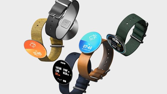
body sits on the watch-strap at an angle, leaning towards the user. Designed to make it easier to read the time without tilting your wrist too much, the Circle watch’s own inherent 15° tilt gives you a clear view of the watch’s always-on display at all times. This tilt also creates space for a button right behind the Circle’s body, allowing it to remain otherwise thin and minimalistic. The button hides from view (unlike in the Apple Watch, where the crown forms a significant part of the watch’s aesthetic), giving you a smartwatch that just feels clean and sophisticated, and focuses on the good stuff with a convenient, tilted UX and a boundless, edge-to-edge UI.
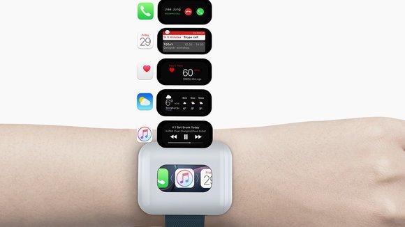
A concept’s biggest objective is to open the mind to possibilities. To spark the imagination. So while I don’t know what to feel about this
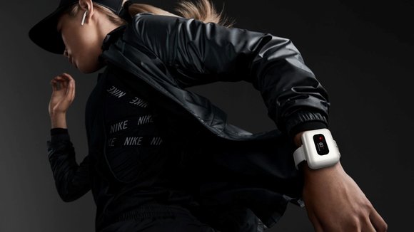
, I can only imagine its immense potential. Here’s what Jiae Jung is proposing. Rather than storing your Airpods case in your pants, and rather than having a floss-box-shaped case that doesn’t do much, Jung’s revisited the entire product altogether. The new Airpods case houses a screen (a pretty small one) and has the ability to snap to a smartwatch. When it does, the Airpods case BECOMES the smartwatch, mirroring contents onto its own screen. The smartwatch sitting under the Airpods case comes with its own b/w screen that shows the time and date and becomes a true smartwatch only when you mount the Airpods case onto it. When mounted, you can read messages, track your fitness, and obviously listen to music. The band around your wrist not only transforms your Airpods case into something slightly more meaningful but also gives you a proper place to put it, rather than in your pockets.
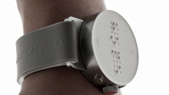
has been designed especially for the visually impaired. It showcases the time using tactile clues, instead of visual ones. Weighing at a light 33 grams, and with four active braille cells powered by a li-polymer 400mAh battery, the smartwatch makes time-telling extremely easy for disabled individuals. It is compatible with both iOS and Android, and is the perfect integration of form, functionality, and style in an inclusive design!
发布于2021-08-17
相关推荐
