1/6
What if the PlayStation 5 was designed by Microsoft instead of Sony?
While I’m firmly of the opinion that the PlayStation 5 has a much more alluring design than the Xbox Series X, I can understand why some find the geometric, boxy design of the Xbox more soothing. It’s traditional, bordering on no-nonsense, and the straight lines seem like the logical decision in today’s hyper minimalist world where almost all of our gadgets are rectangular. Although, as boxy and straightforward as the Xbox Series X is, it’s just not a PlayStation… right?
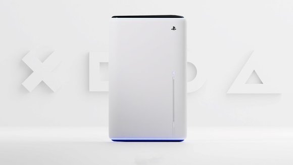
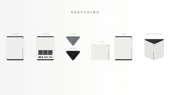
If you’re a PlayStation enthusiast who finds themselves ‘questioning’ the console’s organic design, Ismail Mits has a compromise for you. His PlayStation 5 concept features a geometric design that feels like a well-calibrated blend between the styles of Sony and Microsoft. The conceptual console is shaped like an extruded right-angled triangle. Its dynamic design lets you keep it any-which way on your table, and the triangular top plays in well with the triangular icon often used in the PlayStation visual assets. The ports are located on the wider face, while a neatly positioned slit on the front acts as the disc drive. The ‘boxy-yet-not-boxy’ PS5 concept sticks to the same Stormtrooper color palette of the original design, and even features the same blue lighting, albeit at the base of the device, allowing it to give the floor or your TV cabinet a nice wash of azure blue when the console powers on!
Designer: Ismail Mits
发布于2021-08-17
设计师
Ismail Mits
相关推荐
