1/21
Sleek and modern appliances to perfectly match the interiors of your millennial home!
Home appliances are essentials in our houses. We need them to carry out a variety of activities, from storing food to watching our favorite sitcoms, washing our clothes and even keeping us cool in the summer! Televisions, refrigerators, air purifiers, washing machines – these are a few appliances that you find in every home. However, they often tend to be quite hefty and cumbersome! And that isn’t a look that suits our modern millennial homes very well. Hence, we’ve curated a collection of sleek, minimal, and trendy home appliances that merge perfectly with the modern interiors of our modern homes. These designs promise to seamlessly become a part of your living space, without standing out and looking like an eye sore. They’re a visual treat to our eyes, and not to mention super functional appliances that we absolutely cannot survive without!
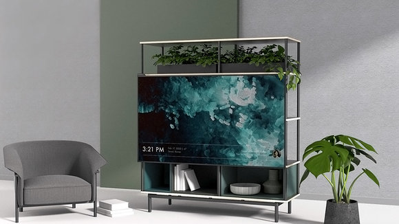
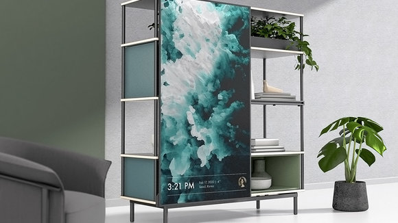
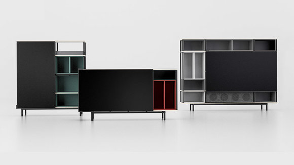
Inspired by the Dutch painter Piet Mondrian’s composition of form and color,
was made to allow a wide range of applications and blend into any interior setting. The aim was to solve three issues we experience with watching TV as we currently do – taking up space, not matching with the aesthetics, and lack of expandability. Urban apartments and single-person households need to maximize their space and should not have to choose between a large appliance and furniture when they can have both. Talking about interior aesthetics, TVs are now increasingly slimmer while the furniture remains warm and cozy – this causes a visual mismatch when the two are put together. Mondrian’s design serves both purposes with one seamless structure. TVs are now being used in many ways and need to be able to adapt to the different content it supports, not just static pre-made products.
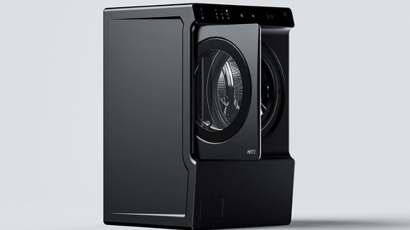
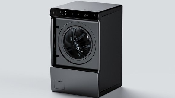
, as its name suggests, features a hiding door that helps it occupy a little less space when in use. In the event that your washing machine’s door ends up blocking a pathway if opened, or colliding with a pillar/wall/door, the Hide allows you to simply circumvent that problem by tucking the door right into the machine’s body. This results in a marginally wider machine, but here’s where user behavior comes into play… people usually buy machines after comparing measurements with their laundry rooms, but they don’t always account for the washing machine’s door and how it opens. The Hide’s door opens like any normal one, but then immediately slides into itself, freeing up your passageway so you can walk around and go about your laundry.
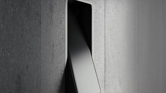
Unlike most switches that have an ON and an OFF,
behaves slightly differently. Designed to be a lamp in itself, the switch rocks upwards, downwards, and rests in a neutral position. While in neutral, the light stays off, but the minute you rock it either upwards or downwards, it turns into an ambient lamp, casting light in the direction it’s been angled. What’s remarkable about the Switch is that it’s a different product with the same UX as its predecessor. Designed to be switched on and off just like a normal switch, the lamp explores new ideas, making it rather innovative. Plus, it only seems natural that the lamp should go off when the switch is in its neutral position, flush against the wall!
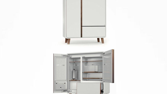
Designed by Difei Wang of
, the Art Fresh Bar refrigerator is the first in a handsome series that aims to mimic the look of traditional furniture pieces. In fact, it’s not even intended to be placed in your kitchen. Rather, its ultra-thin profile and fine finishes are designed to blend in with your living room, giving you and the rest of the family easy access to all sorts of snacks, beverages, and one-off items like wine and fruit. With an anticipated selection of various finishes and colors as well as customizable compartments, there’s sure to be one to satisfy any taste or use.
is very unlike the espresso makers in the market and it’s the aesthetics that set it apart. It is a dream machine for people who love coffee and space exploration equally (like me!). The compact capsule shape makes it look like a moon lander for your counter and is obviously powered by caffeine which is only the second most powerful fuel after rocket fuel! The designer’s main focus was to retain some of the rawness and the mechanical steampunk look of the traditional Italian espresso makes while maintaining a clean shape that adds character to the product. There is a tubular water/steam container at the back which I feel can be extended down for added support for the appliance. There is also another container for your beans which I assume leads to a small grinder mechanism inside so you only get the freshest cup of joe each time. Overall, the shape is very unique and combines the nostalgic steampunk elements with clean, smooth curves for a balanced modern machine.
Just when you thought you’ve seen it all, we have another cool appliance to add to this list – say hello (from 6 feet away) to
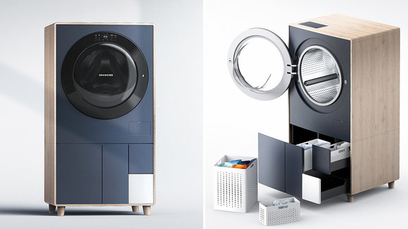
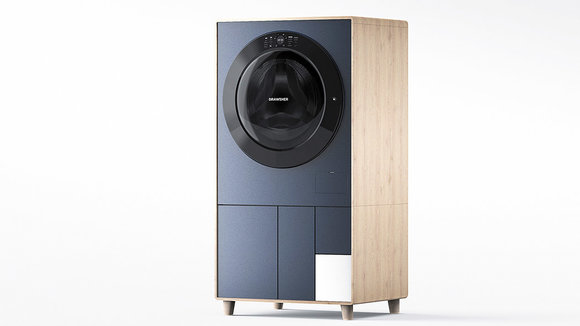
which is the child of a washer and dehumidifier! Laundry is one of the most disliked chores and so it is no surprise to me that many of us just let the clothes be in the basket till we run out of fresh underwear. It may not be stinky or filthy, but it is certainly not the most hygienic practice because you are lettings the bacteria from the clothes spill into the air around you. Also, if you don’t air out your washing machine after using it, it can lead to molds and malfunctioning of the appliance. Keeping all these details in mind, designer Kikang Kim created Drawsher which is a sanitary machine that functions as a laundry basket and a washing machine. You’ll notice that it also looks good unlike any washing machine you’ve seen before, and that is because Kim has based the design on a modern dresser that optimizes space and blends well with your interiors.
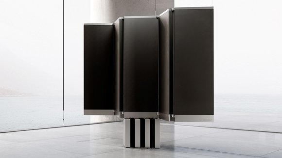
C SEED, a company known to make high-end outdoor televisions, has debuted
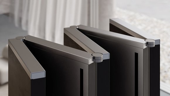
– a whopping 165-inch 4K MicroLED beast that folds up and tucks away right underneath your floorboard. Before you get any ideas, the television retails for nearly half a million dollars, so it’s safe to say that only a select few will be able to afford this bad-boy. It may be the world’s coolest party-trick, but imagine being able to summon a television from the underground as your guests watch in sheer astonishment. Hit a button on the remote and the floor splits apart, with this pillar rising from within the chasm. The pillar then unfolds into a wide 165-inch screen, perfect to watch the Golden Globes on. Fashioned with 5 display panels that open and close like a folding fan, the M1 television really knows how to make an appearance. Its elaborate structure features a base that the display panels lock into once they open out. This base also houses the television’s powerful speaker system, including two 250W broadband speakers and one whopping 700W subwoofer to really pack that punch. While those stats may be impressive to a few, it’s the TV’s design that really gets my heart racing! The M1 doesn’t come with a single folded display, but rather features 5 panels that can seamlessly merge together to appear as one singular panel.
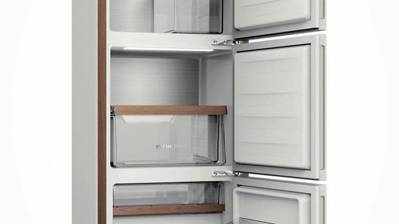
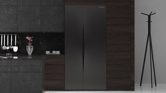
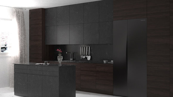
Kim Hyunsoec of hs2 studio created
. Crevice is a beautiful 900x1970x920 mm double door fridge. Inspired by the experience of drawing your curtains wide open, the handles of the double door of Crevice completely resemble the opening of a curtain! The neat slit with its widened edges facing opposite directions brings to mind the exact moment when you grab the corners of your curtain, to tug them apart on a lazy Sunday morning. Created from stainless steel and featuring a matte black sheen, the aesthetics of Crevice have been designed to complement the interiors of your home. More than an electrical home appliance, it gives the impression of a piece of furniture. The furniture-like feel it resonates makes it suitable to be placed not only in the kitchen but also in the dining or living area. Spacious from within, it is divided into four vertical compartments with six shelving areas, providing ample space for your innumerous groceries. Not only is Crevice a storage wonder, but we must commend the visual appeal it possesses. This is a refrigerator with style!
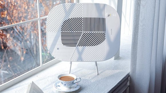
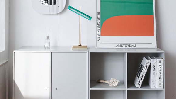
The difference between
and every other air purifier on the market is evident in the way it’s designed. The Löv does to air purifiers what the Nest did to thermostats. It comes with a sophisticated design that just beautifully blends into its surrounding decor, looking modern and artistic rather than antiquated and technical, and comes with a user experience that’s so simplified, anyone could use it. The Löv air purifier is a pleasure to use, but it’s also a pleasure to look at… and that’s a design direction most smart home product manufacturers try to take, be it Google, Amazon, Apple, and even companies like IKEA, that are only now entering the smart appliance market. The key to a well-made smart-home product is to not only realize its relationship with the user, but also its relationship with the space it’s in. The Löv looks quite unlike any purifier you’ve seen, with an aesthetic that embraces the minimalism of Scandinavian Design. Created to seamlessly blend into your home, the Löv comes with a soft, rounded form, and an abstract grille design that balances art and engineering. The grille pattern is inspired directly by natural details like branches and the veins of a leaf, becoming an ode to nature, the world’s own air purifier.
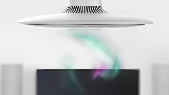
Winter is on its way out soon, but you can keep it coming every day of the summer season, thanks to the atypical
. Unlike most air conditioners, Lora is not boxy nor an air curtain. It’s more like a pendant lamp that hangs from the ceiling and showers you with cool air. Adding a touch of ambient lighting to the mix (think Northern Lights), Lora goes on to showcase the fan speed, temperature, and air blast in correlation to mesmerizing twinkly lights. What I really appreciate is the attempt to break the clutter and give a new form to air conditioners. Adding lights and intuitive UI UX is just a bonus.
发布于2021-08-17
相关推荐
