1/12
A touch panel gives this ingenious keyboard surprising Apple Touch Bar-inspired user interface
The idea of a full-size
with a touchscreen panel on the top that can be customized to launch the application(s) of choice in one easy click, will surely find appreciators.
has ditched the infamous Touch Bar in the new 14- and 16-inch
Pro for 2021, which was announced at the company’s October product event. Despite the many flaws ardent fans may have noted, the idea of a touchscreen bar on the keyboard has been an inspiration for many designers. We figured this out when we came across
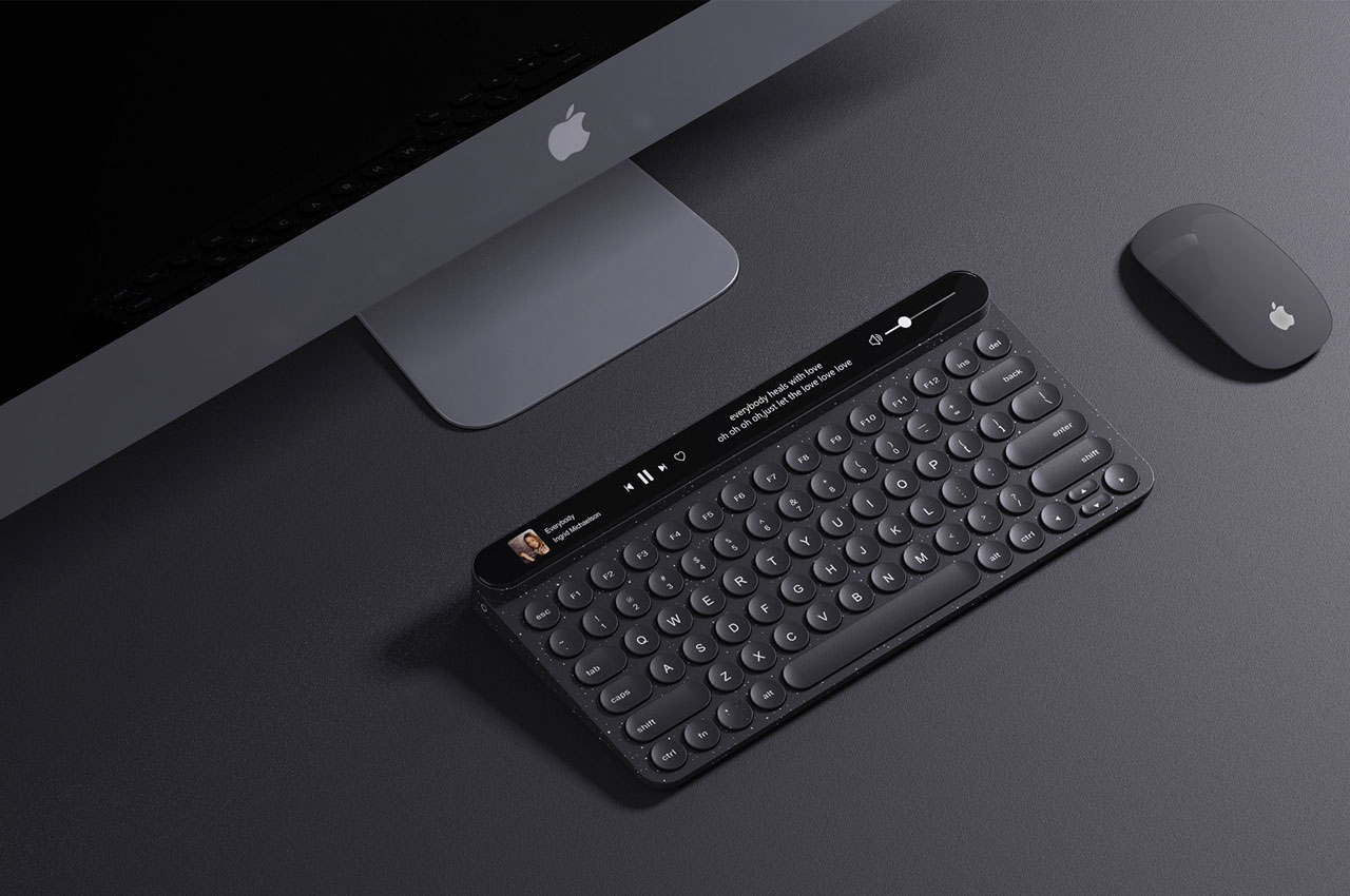
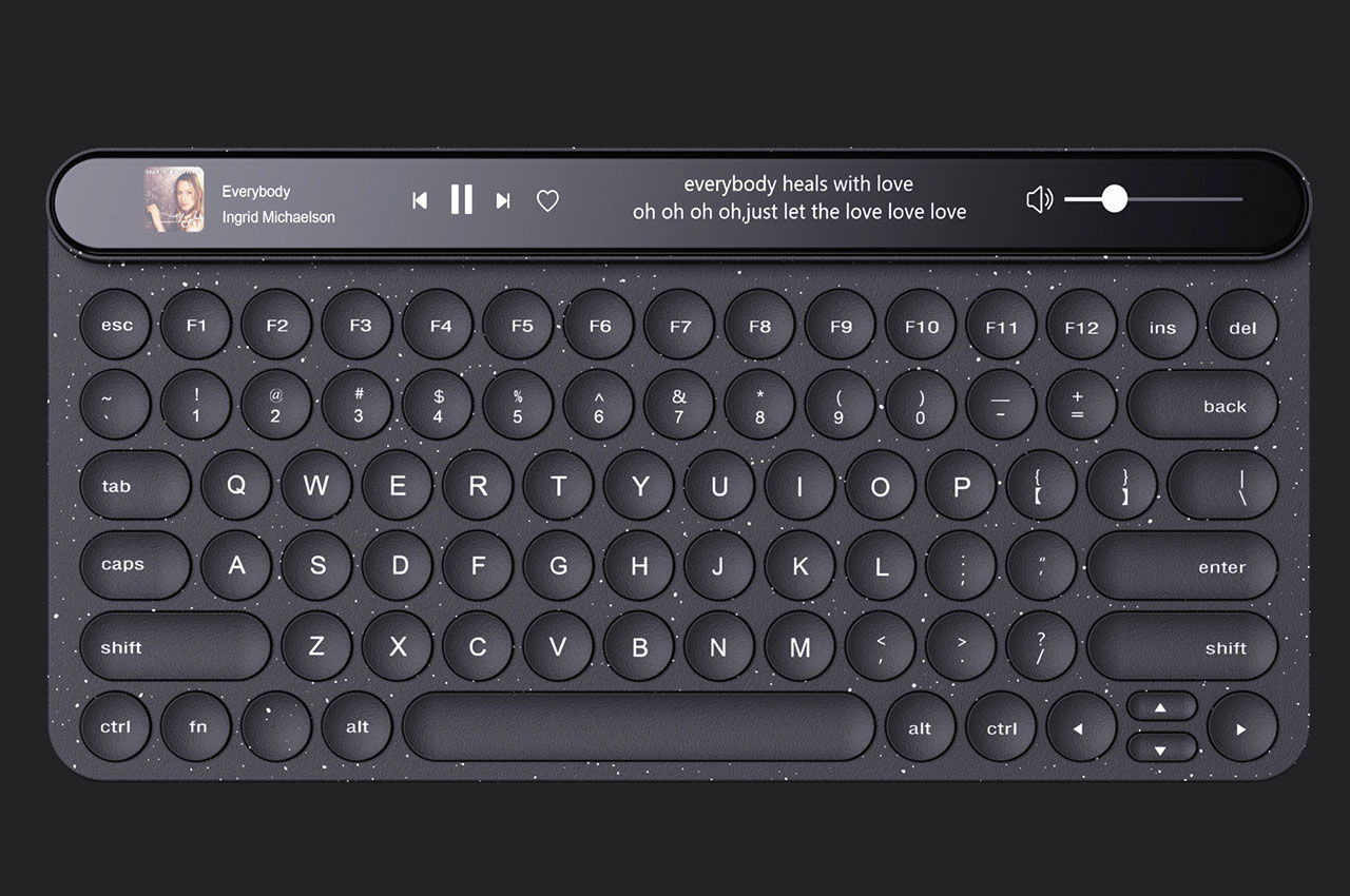
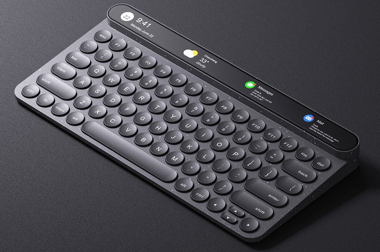
. Now, the Touch Keyboard envisions a different approach to the same idea. This keyboard is designed to work with a PC or Mac if by virtue of a full-size keyboard that features a narrow touch bar display along the top of the keyboard – as an extension but in the same design!
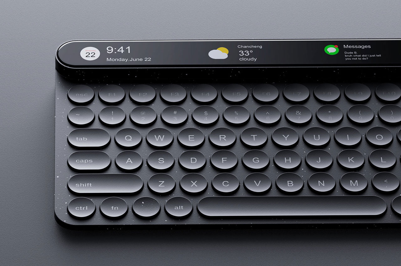
The Touch Keyboard as it is called (owning to the introduction of a touchscreen bar to it), is a brainchild of designer Wenhua Xu, who believes people should have direct controls to certain apps on their keyboard. The touch panel is certainly a surprising new user interface option, which will make interaction with the apps more convenient as opposed to the physical buttons. The downside is, not many people appreciate the idea of a touch interface on the keyboard, as we have learnt from the introduction of the feature on the MacBook Pro about five years back.
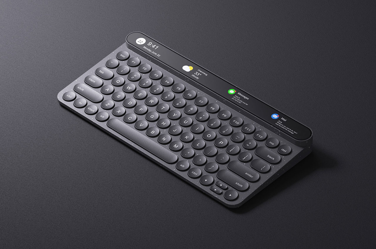
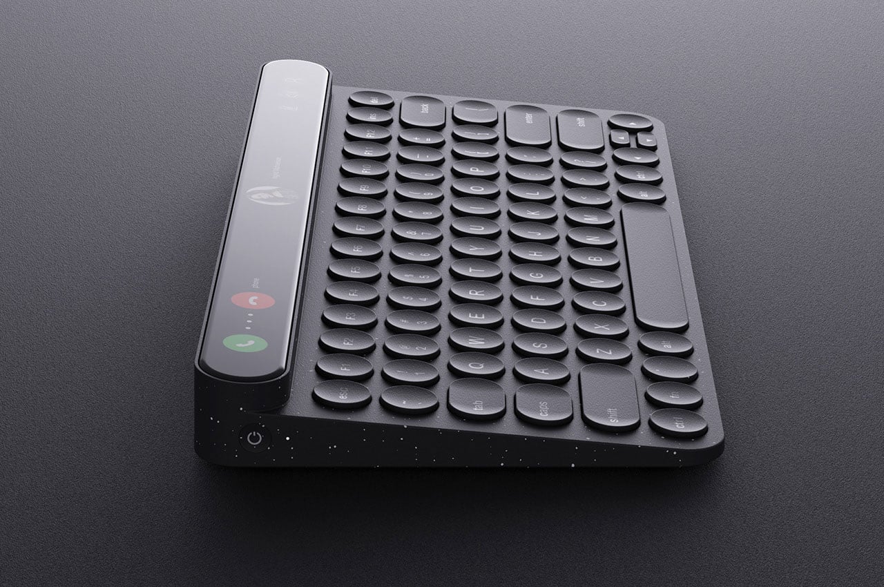
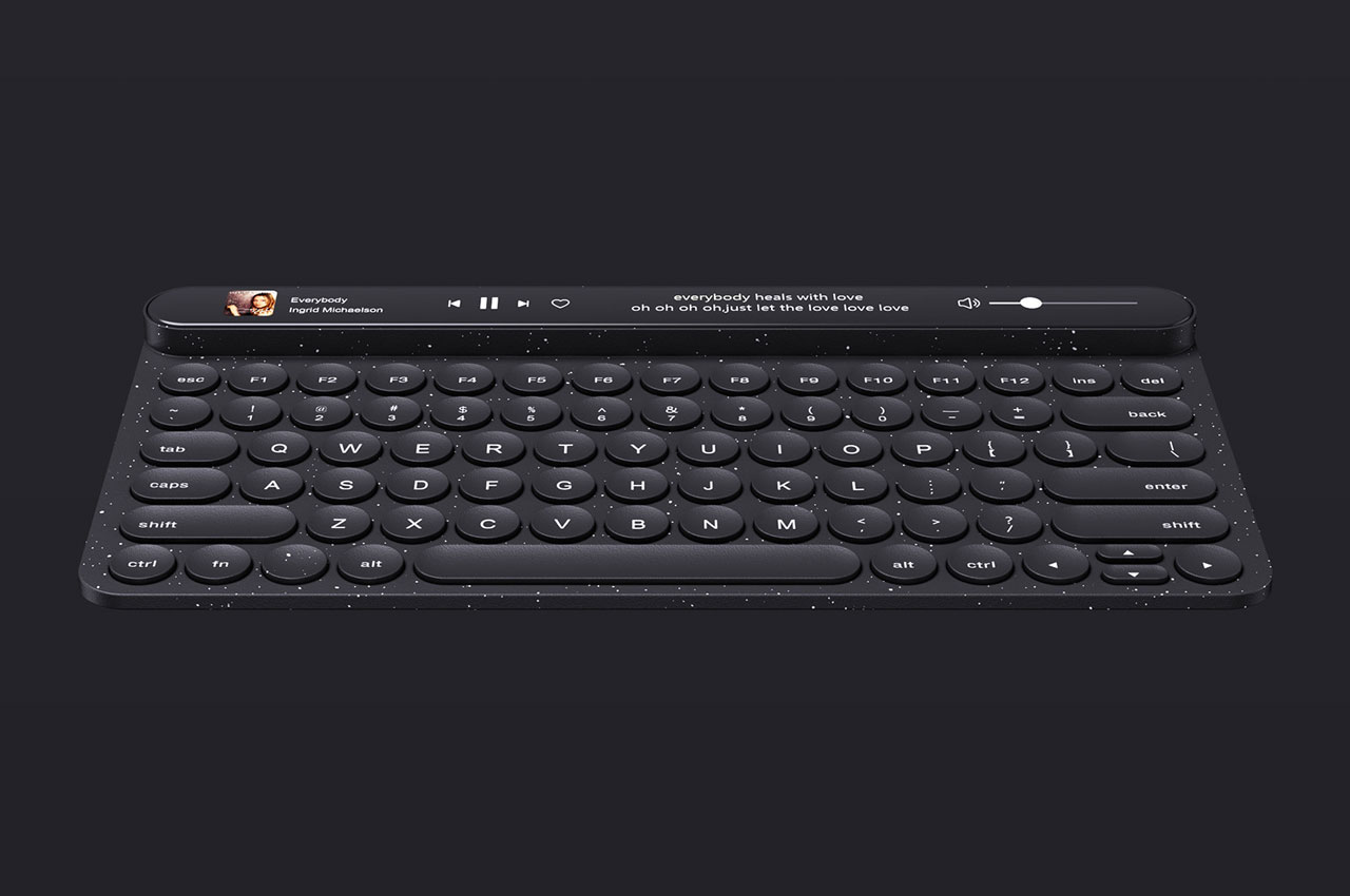
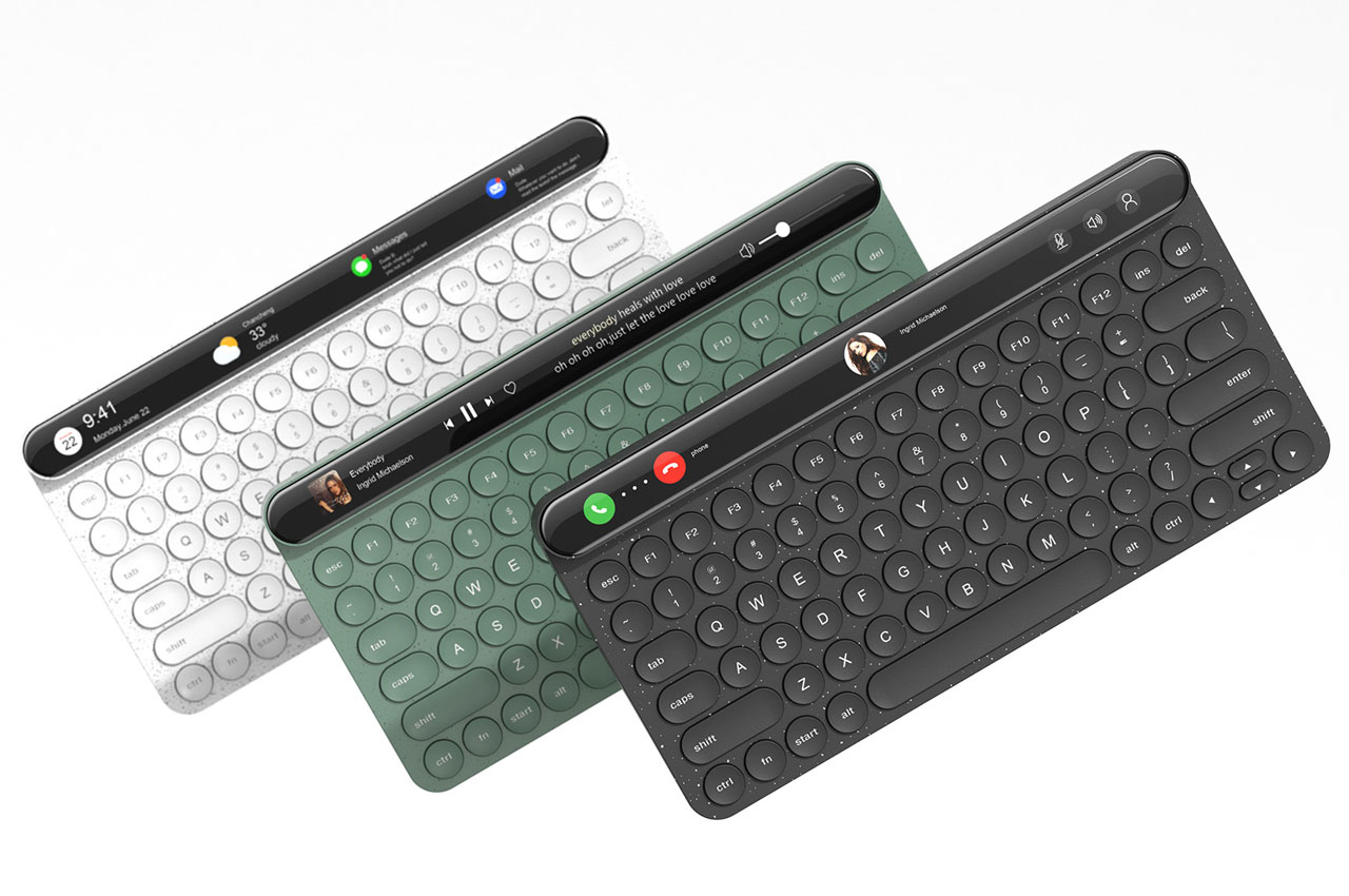
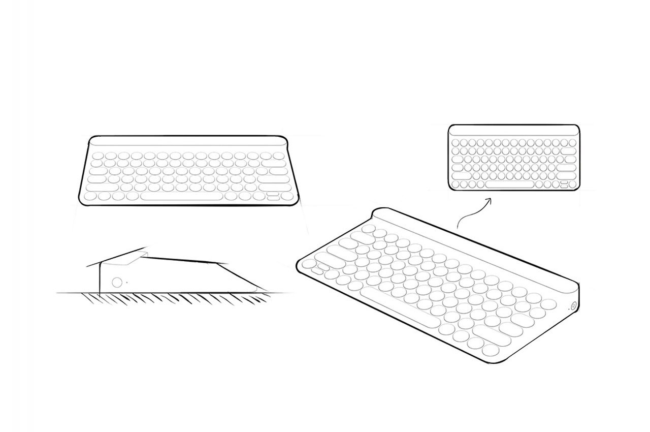
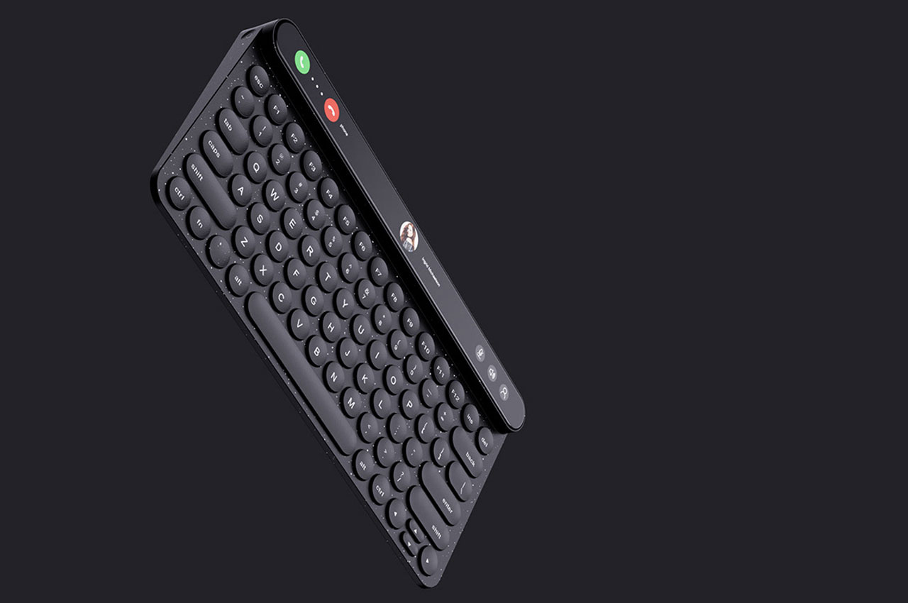
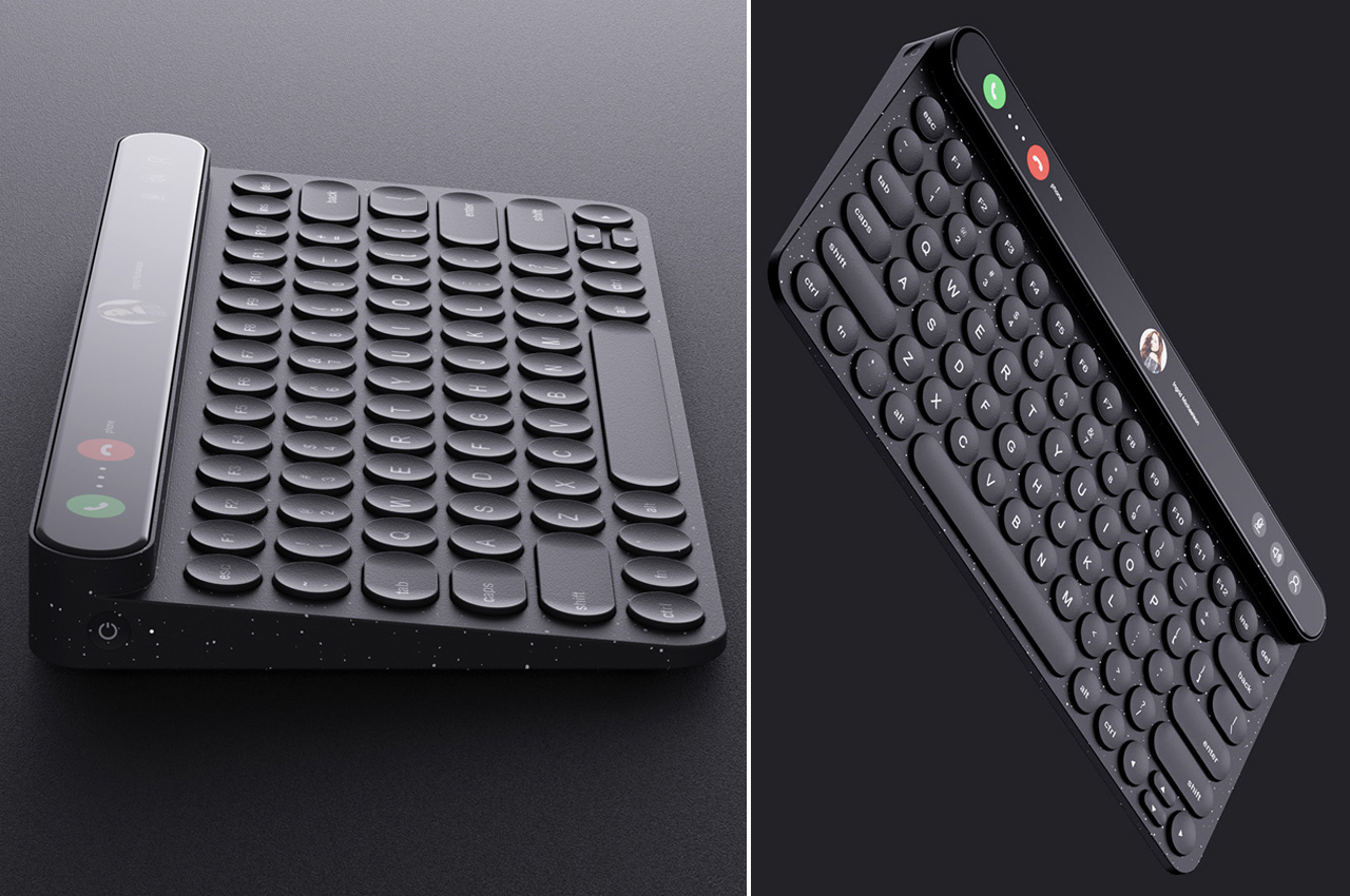
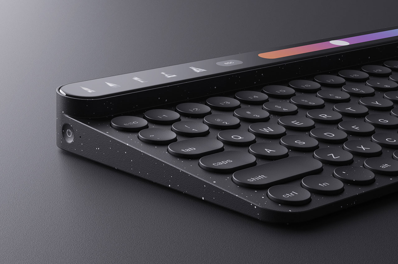
The interesting thing here is that the touchscreen on the keyboard is made to look, act and work in ways more than that we have seen on Apple laptops. Presumably, this new take will find some takers, since the design will make actions more convenient. For instance, the users will be able to select a few applications they require and operate them from the touchscreen. This will include receiving and making zoom calls or a facility to place some widgets on it to interact with them without having to search them up on the computer. From how the Touch Keyboard images appear, this will be more interesting to type on than the traditional keyboards. The majority of the keys are circular in shape, while some utility keys like the Tab, Caps, Shift and Space Bar are all oval. The touchscreen is slightly higher than the keys, which means the keyboard is thicker at the top and it also features a power button on the left side, which could probably enable or disable the touchscreen or the keyboard in its entirety.
I’m personally not a big fan of the touchscreen panel on the keyboard, but considering you can have features of choice here, customized to need, this could have some potential utility for people who like to toggle between apps more quickly – for example, music controls to taking calls, and from widgets to controlling the brightness of the system. My major dislike for the feature is because of the energy consumed to run the touch panel can drain the keyboard battery faster and that it will add to the already considerable cost of the peripheral.
Designer: Wenhua Xu
发布于2022-01-11
设计师
Wenhua Xu
相关推荐
