1/22
Apple Designs that we wish had been launched at the September 2021 event!
September 14th, 2021 was an exciting day for the entire
world!
had its much-awaited event, and as it ended, it left us with some pretty amazing launches. Apple revealed the iPhone 13 models, the Apple Watch Series 7, the new iPad, and iPad Mini. The leaks that have been pouring in for almost the past year left us with some major expectations. Some were met, and some were not. This year’s iPhone has a smaller notch, bigger battery, better chip, and not too many major changes. While The iPad Mini comes with a modern flat-edge design, an ultrawide camera on the front, TouchID in the power button, support for Apple Pencil, USB-C, and 5G, making it an absolute behemoth even for its size. As we pour over and explore what Apple did give us this year, we can also fantasize about what it didn’t! We’ve curated a collection of ingenious conceptual designs that we WISH Apple had launched this year. From an Apple device that merges AirDrop with an external flash drive to an iPod Classic
that celebrates its 20th anniversary – these are the designs you wish you could have seen at the September event!
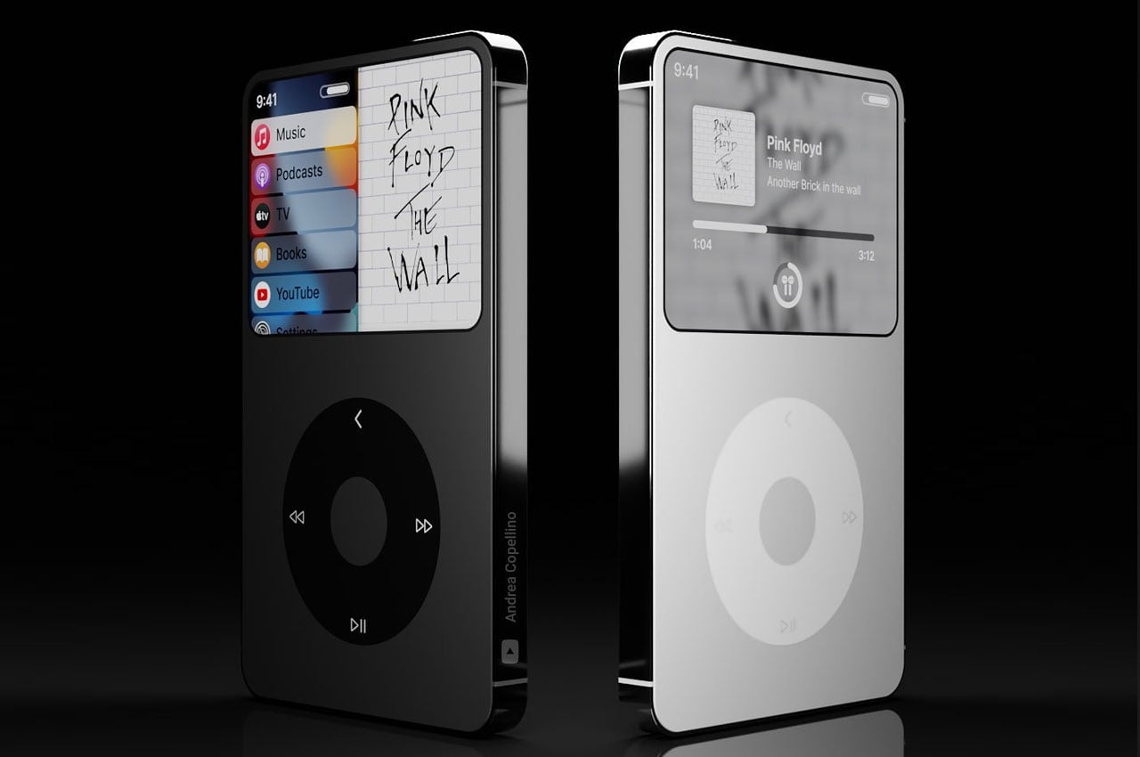
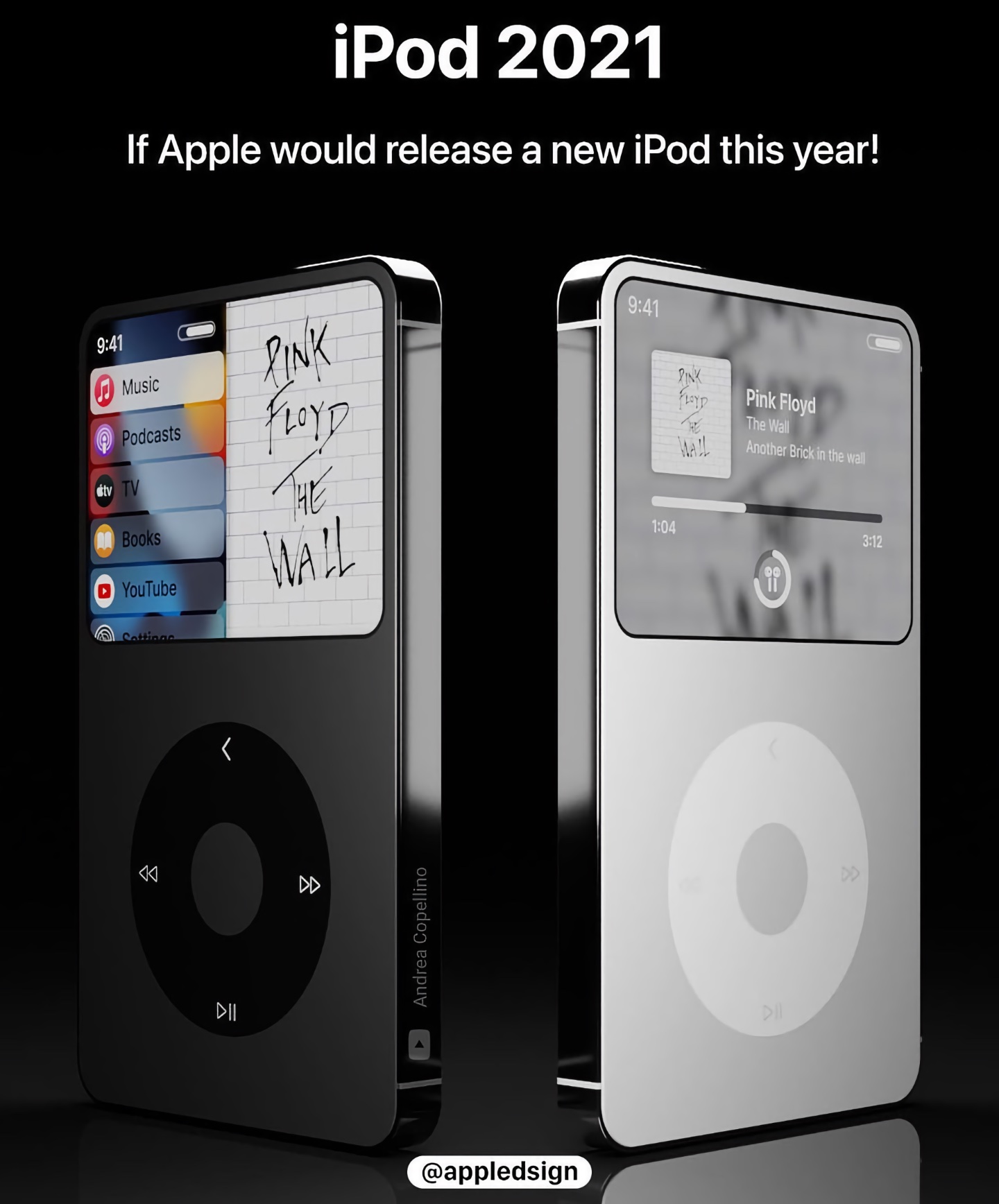
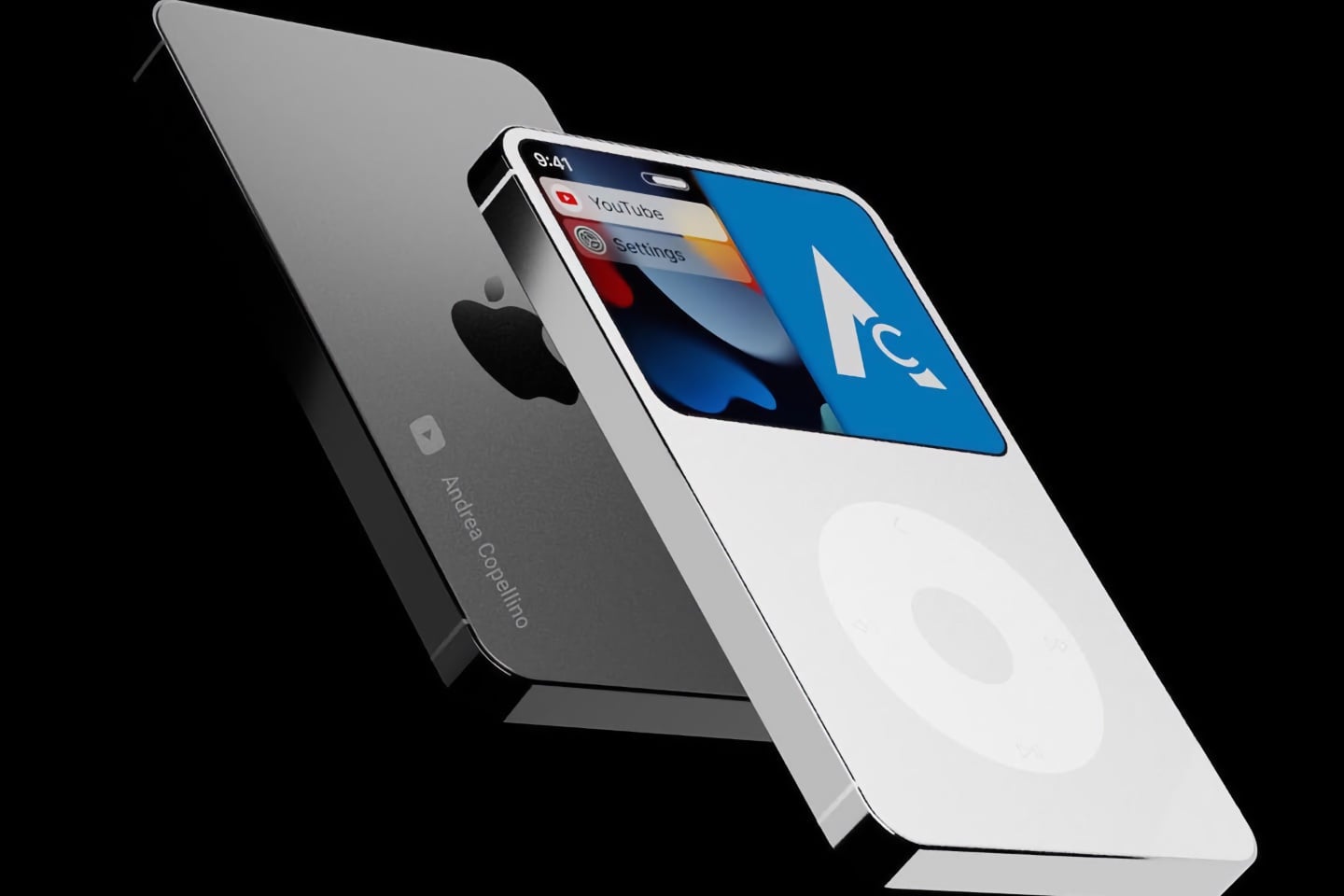
The iPod officially turns 20 this year, and we do wonder what if Apple had released a newly designed iPod Classic to celebrate its 20th anniversary?! Andrea Copellino took the iPod classic and gave it some modern touches – thin bezels, curved edges, and a lot of glass! He did however maintain the iconic click wheel but integrated it with the concept of a magic trackpad, so you don’t actually have to click anything. He wanted to create an iPod design that harmoniously integrates the old and the new…a design that celebrates everything we loved and appreciated about the iPod while adding some much-needed futuristic upgrades. I do wish I’d gotten to see this launched at the September 2021 event!
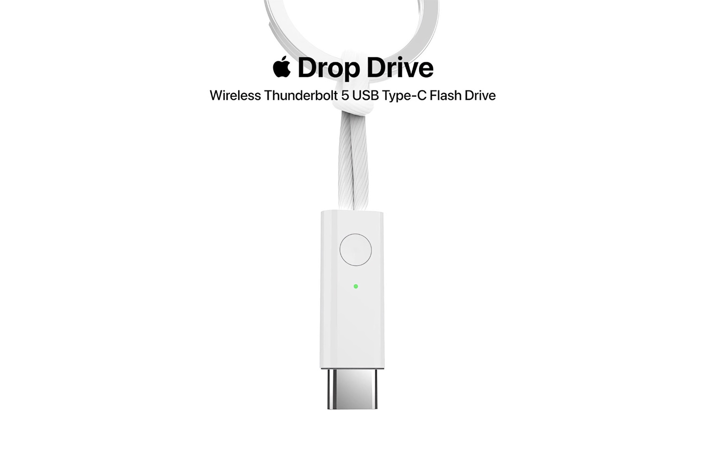
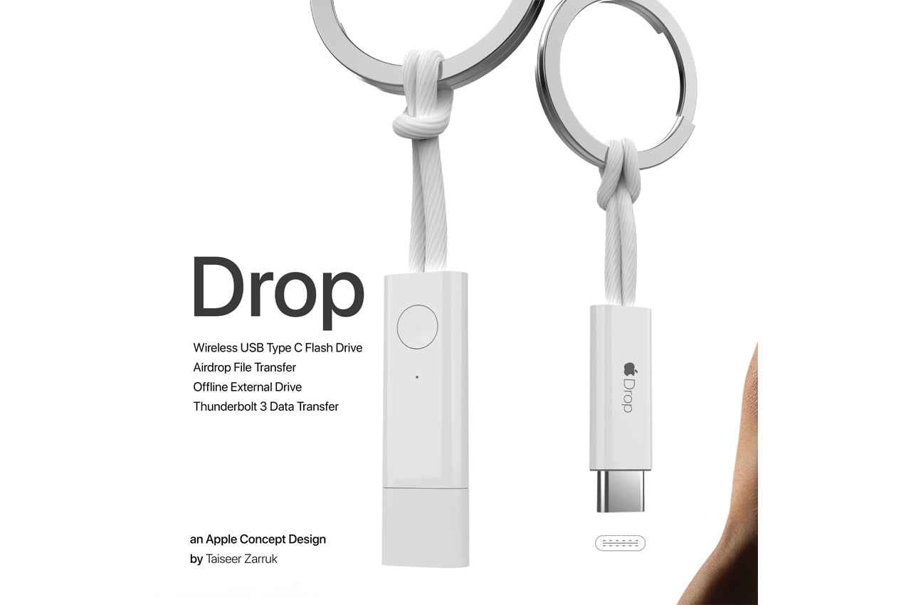
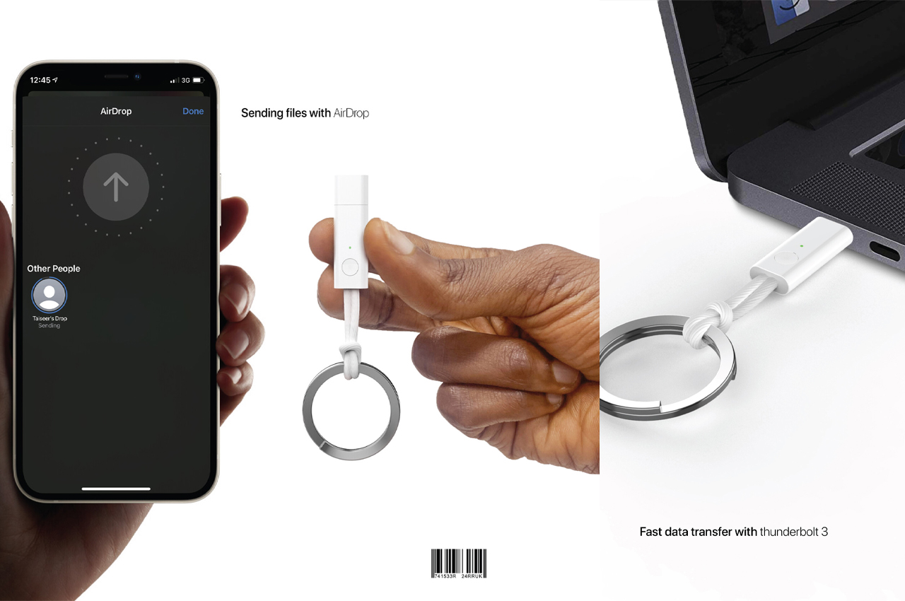
Incorporating Apple’s design and technical language into his product, Taiseer created
to make file transferring and storage between Apple devices even easier. Drop operates as a wireless USB Type C and offline external flash drive and an AirDrop file transfer and Thunderbolt 3 data transfer device. Drop is a standalone Apple-inspired device that operates as a flash drive, storage device, and file transfer cable. Users can AirDrop files from their iPhones or MacBooks to Drop where the files can be stored or transferred to another, Apple or non-Apple, device. Alternatively, users can store files offline using DropDrive, a feature that creates a folder on the user’s iPhone to store media files, where the files remain until Drop is brought back online.
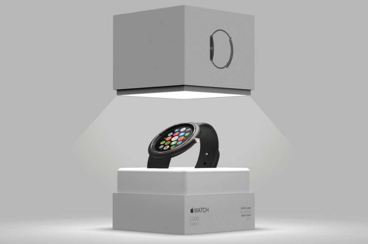
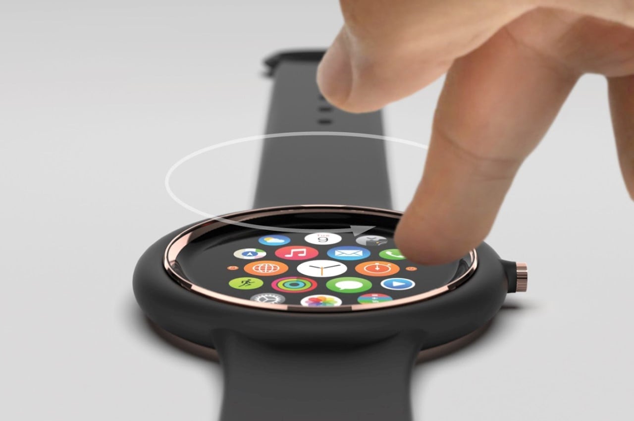
three drastic changes include A. its circular body, and B. the concave screen, and C. the watch strap, which forms a bumper around the smartwatch’s main hardware. Designed to provide a compact-yet-robust experience, Duarte outfitted the watch with a concave screen that’s extremely user-friendly, yet is impossible to damage when you accidentally bump your hand on a surface. Similarly, the large rubber bumper around the watch’s hardware component provides similar shock-absorbing features (although it does result in an unavoidably large physical bezel around the display).
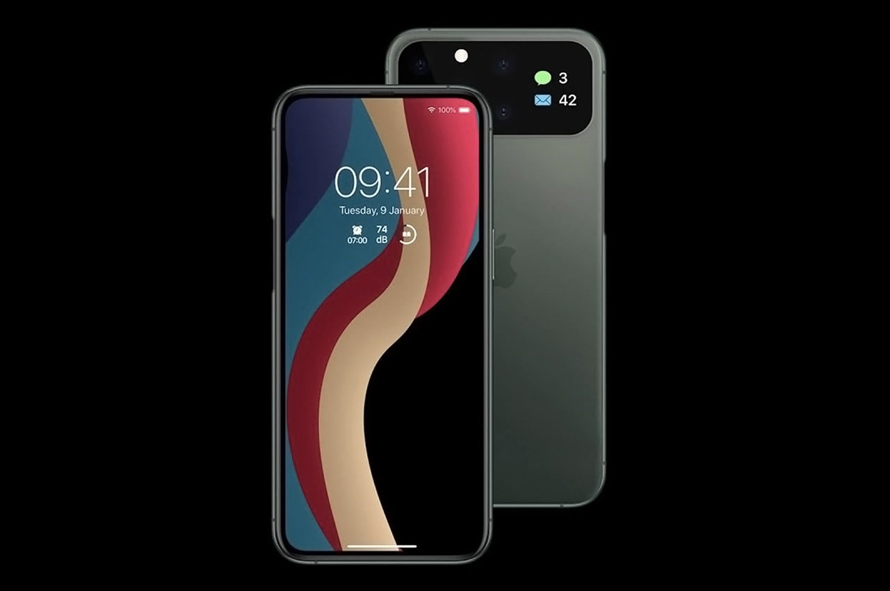
Copellino’s
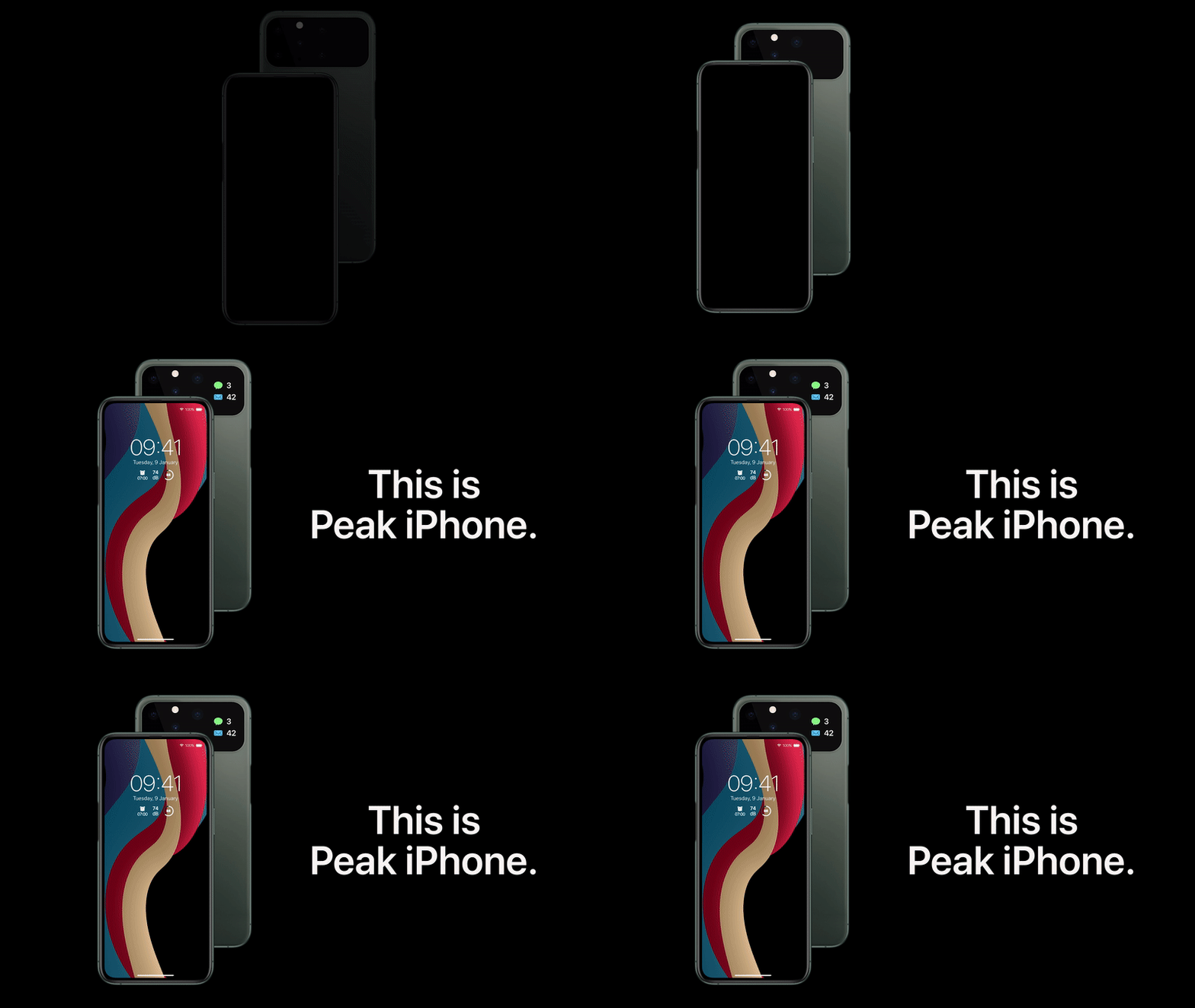
stays mindful of a few things. It doesn’t employ innovation for the sake of it. No waterfall displays, no folding screens, no fingerprint sensor in the Apple logo, no headphone jack to make Apple look like it’s backtracking. The elements of Copellino’s Peak iPhone are simply external hardware features that take the original iPhone experience and amplify it. There are also a few internal hardware considerations that I’d like to see in the iPhone but they aren’t any different from the stuff MKBHD always talks about, like much longer battery life, a higher refresh rate display, possibly a migration to USB-C charging, and possibly the ability to add a memory card to your iPhone.
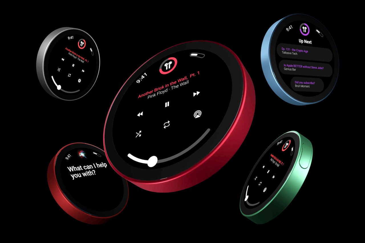
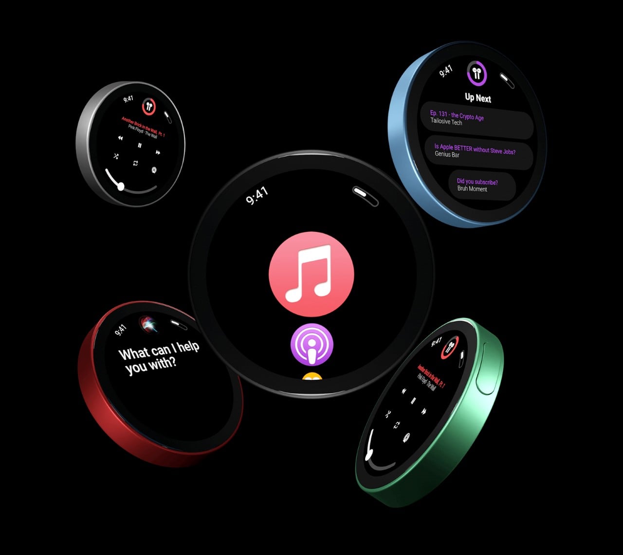
As Apple gradually began phasing out the iPod, it increasingly began looking like the iPhone (in fact the iPod Touch was almost indistinguishable from earlier models of the iPhone). Copellino sidesteps this problem by giving the iPod a complete refresh and making it circular. The new
paves its own path forward with a fresh new design that’s instantly distinguishable from the iPhone. It sports a circular UI that Copellino designed from scratch too, borrowing elements from the Apple Watch. It also comes with a circular display that looks just marginally smaller than the one used on the HomePod Mini.
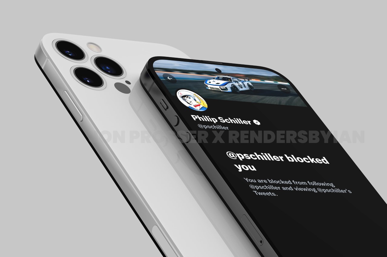
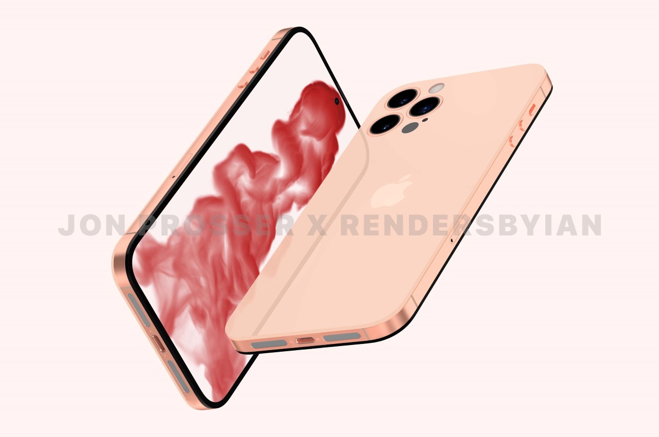
Prosser decided to drop a pretty big bombshell. His leak, he reiterates, isn’t of the iPhone 13… but rather, of
, which isn’t due till 2022. Prosser says he’s been in touch with supply chain workers who have shared images of the new phone with him and has then used those images to create renders that fully do justice to the design. The design in question, celebrates the 10th anniversary of the popular iPhone 4, with a similar flat-edge design, a flat camera module underneath a glass back, and a metal rim running along the sides. A noteworthy upgrade, however, is the presence of 3 rear camera lenses, and the disappearance of the divisive notch, which has plagued the iPhone’s design for nearly 5 years if you count the notched iPhone 13 that drops next week.
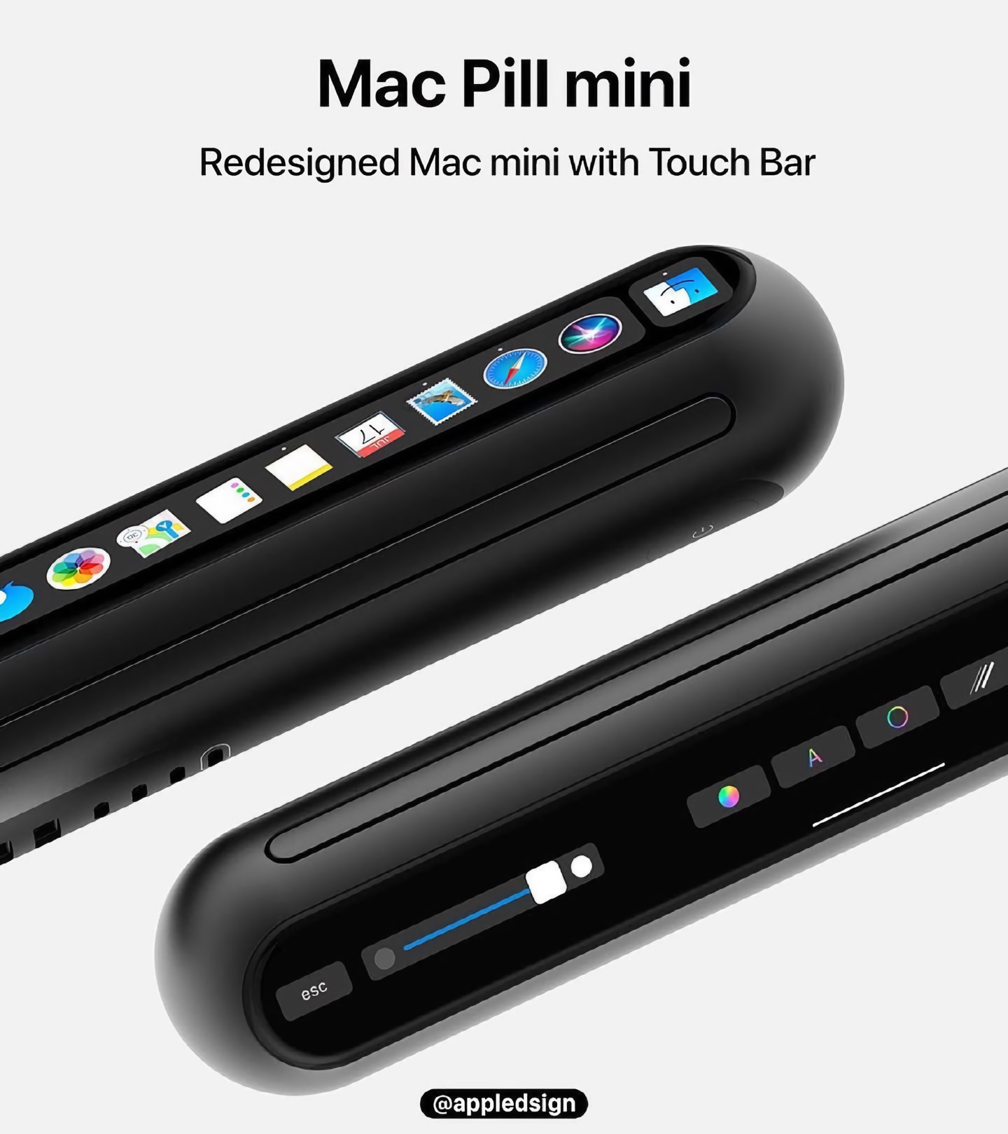
took the current square-shaped Mac Mini and transformed it into a futuristic pill-like design. Called, The Mac Pill Mini, Berger integrated it with a Touch Bar. Although one would wonder, is such a change more for aesthetic purposes, rather than functional ones? Aesthetically, it would contrast with the current Apple designs, which are leaning towards sharp and edgy! Whatever the reason may be for this redesign, it surely is a refreshing one!
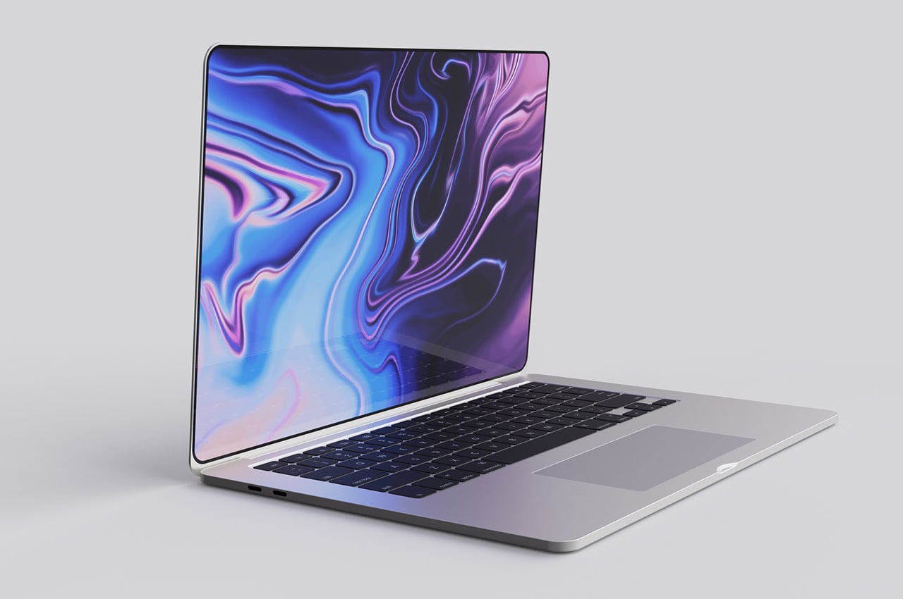
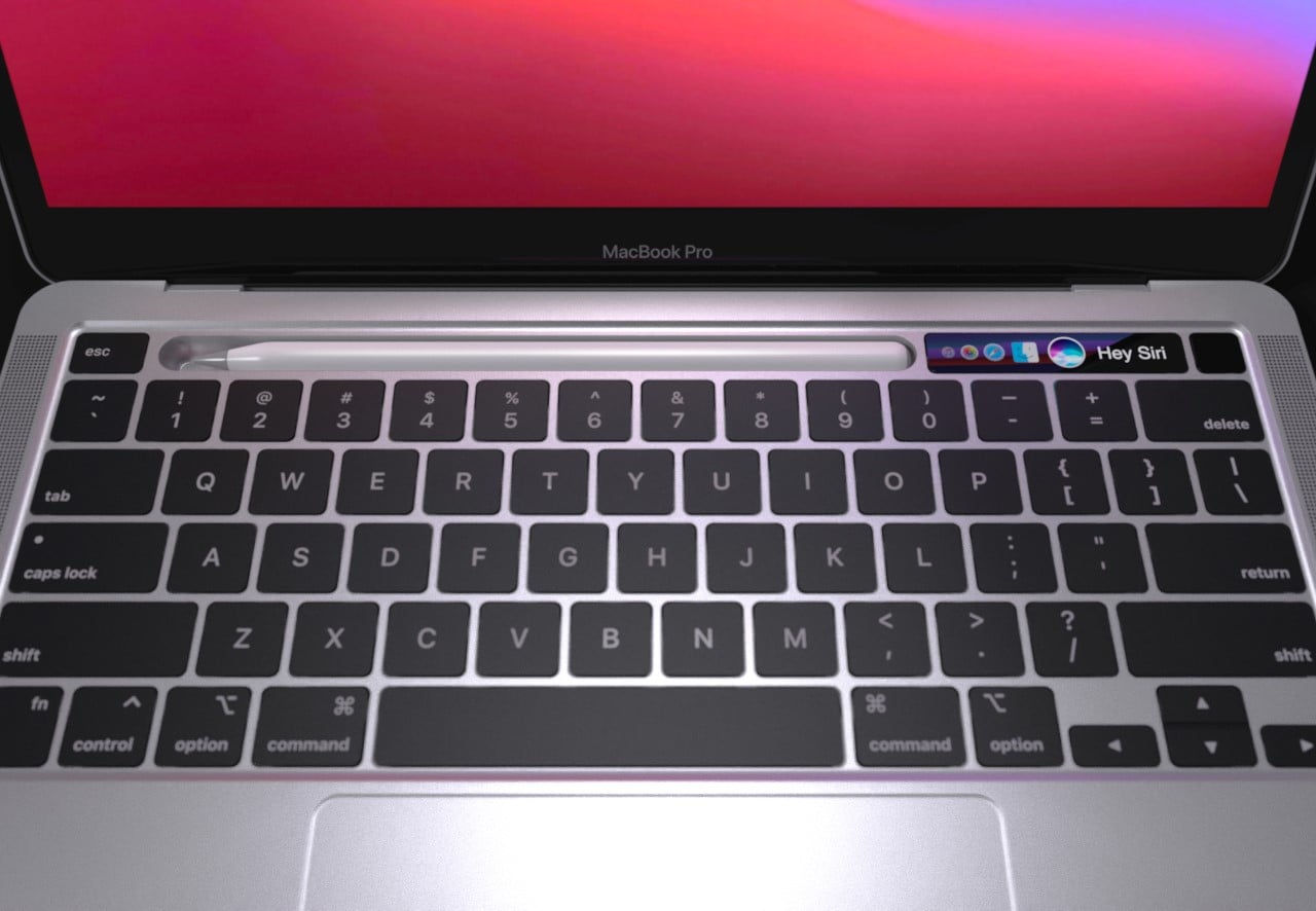
This year, the new Apple MacBook Pro is expected to feature the biggest design overhaul since the 2016 design. The notebook will feature a flat-edged design, doing away with the curved edges for a more iPhone 12-like form factor. The designer here sways from the thought and envisions the design identical to how we have come to recognize the MacBook Pro in recent years, and it looks splendid nonetheless. The most notable difference this year is expected to be in the display. The MacBook will have brighter panels, supposedly with mini-LEDs, the first for the MacBook. Mini-LED display means there will be a significant improvement in the screen’s picture quality, contrast, and brightness.
suggests thinner bezels.
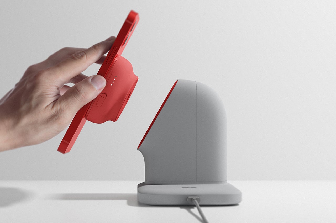
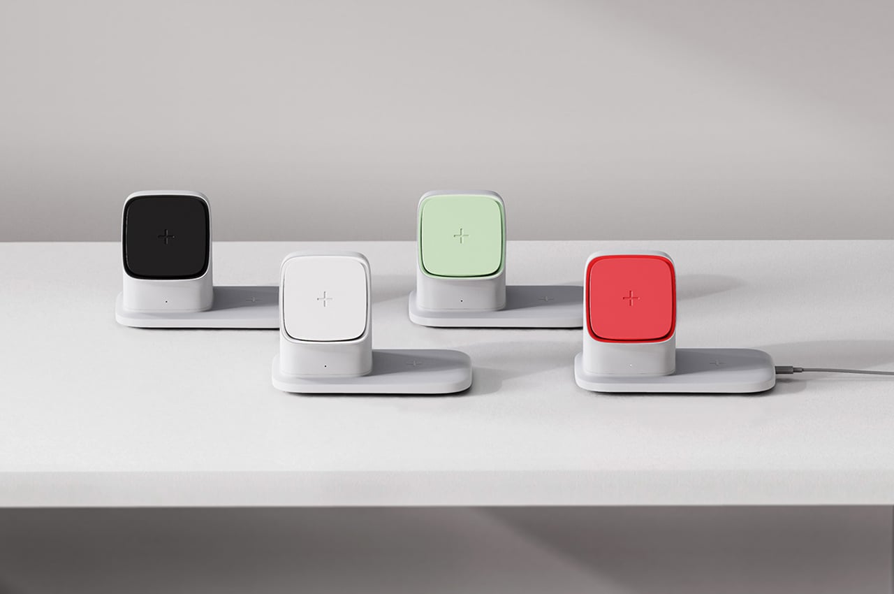
is a wireless charger that can be either mobile or stationary. Much like wireless chargers already on the market, Chau comes in two parts: a wireless charger and its charging dock. The charging dock can be plugged into any outlet and features two charging stations for Apple products. The raised charging station holds the auxiliary charger in place so users can either leave their phone to charge on the dock or dislodge the auxiliary charger from its magnetic port and charge on the go.
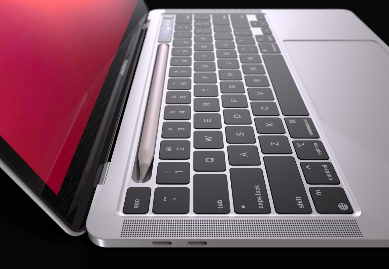
Conceptually, the presence of
feels confusing but also potentially exciting. The minute you introduce a pencil to the MacBook, you’re singlehandedly killing the iPad Pro’s upper edge, but the more you think about it, the more it feels like it just might work. A Mac”Book” and a “Pencil” just instinctively go together, like a notebook and a pencil, right? Besides, it creates a synergy between the two products, and I can just imagine Craig Federighi dragging files from the iPad Pro with a Pencil onto the MacBook and having them carry over from one device to another, extending the user experience of Apple’s Universal Control feature!
发布于2022-01-11
相关推荐
