1/3
Dalston's Rebrand
Soda brand Dalston’s transitioned through a period of huge change with the aid of effective design, growing the business beyond local distributers, to be stocked nationally in over 4,000 outlets and exported to six international markets.
Established in East London in 2013, the brand built its niche success around its ‘hand-made’ claim. But with a labour-intensive production process, the business needed to change to grow.
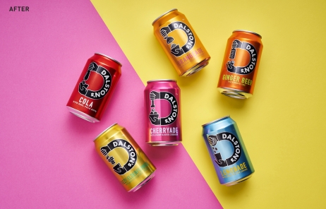
Transforming its manufacturing process and changing to cans rather than bottles was a risky move. But with B&B Studio’s design supporting its strategic ambitions, Dalston’s successfully metamorphosised.
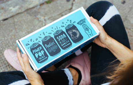
Dalston’s new ‘real fruit’ focus and positioning, bold design with craft codes, and values-driven messaging imbue every aspect of the rebrand from packaging to social media. The brand’s authentic personality and design have turned consumers into advocates on social media and helped Dalston’s pioneer a new ‘craft soda’ sub-category to challenge mainstream competitors.
Dalston’s rebrand resonated with both supermarket buyers and its original customers, helping it win listings in Waitrose, Ocado, Sainsbury’s and Asda, whilst maintaining its presence in existing stockists. Sales grew 217% in the year following redesign, smashing the 100% target, and brands like Urban Outfitters and Dr Martins have asked to collaborate.
发布于2019-12-23
设计师
B&B Studio
设计奖项
英国DBA设计奖
Silver/银奖
2020 年
颜色


