1/4
Budweiser: Taking back the 'AmeriCan' summer
Budweiser had a big task on its hands. Reverse a sales slump by emotionally connecting with once loyal consumers. And it had to do this in the US’s aggressively competitive 2016 summer landscape where the Presidential Election and Rio Olympics took centre stage.
To cut through the noise of the busiest time of year for the beer market, Budweiser knew it needed to do something drastic to spark conversation: the objective was to generate vast amounts of buzz and mentions on media channels.
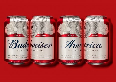
In a bold move, almost every detail of their packaging design was changed to become an ode to the US – even the name changed from Budweiser to ‘America’. Yet, by retaining the original design language, the limited edition packaging was still distinctly ‘Budweiser’.
Budweiser became the focus of more than 2,600 unique stories in media outlets, earning 1.6 billion impressions and being seen by more people than the 2015 and 2016 Super Bowls combined. Sales volume grew for the first time since 2015, with the branding galvanising the nation.
发布于2019-12-23
设计师
Jones Knowles Ritchie
设计奖项
英国DBA设计奖
Gold/金奖
2018 年
颜色


