1/3
Light & Free Yogurt
Perceptions towards health are changing. People are shifting from calorie counting with ‘light’ varieties to more natural products with low sugar, salt and artificial colours and flavourings. Danone saw an opportunity to tap into this market with a mainstream yoghurt that was both delicious and delivered these credentials.
25-44-year-old millennials made up the gap in the market, and Danone knew that if they tapped into this target audience, the growth potential would be huge.
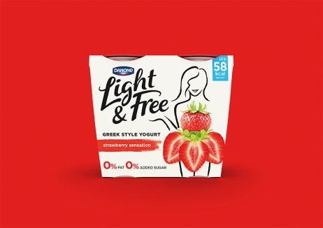
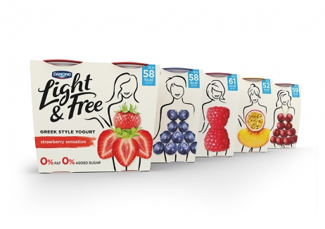
Taking inspiration from clean eating bloggers’ ideals of wanting to ‘look good and feel good’, a playful yet stylish, lifestyle-driven packaging design was created with real fruit acting as clothing for hand-drawn silhouettes of women.
In as little as 12 weeks, the impact was massive. Light & Free had a 13.7% household penetration and a 37.2% repeat rate. And after 32 weeks, 3.9 million households were trying the brand. It was credited as the biggest contributor to growth in the market and achieved the highest penetration of all yogurt innovations in the last four years.
发布于2019-12-23
设计师
Dragon Rouge
设计奖项
英国DBA设计奖
Gold/金奖
2018 年
颜色


