1/3
The Rise of Mercury Hard Cider
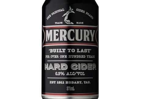
Australia’s oldest cider brand, Mercury, had been declining at a rate of -7% and needed to appeal to younger customers. With immediate shelf impact, the packaging and identity of their innovative new drinks offering helped Mercury pioneer a completely new category in the cider market and transform their outlook.
The cider market is tough to crack and there’s also a ‘sea of sameness’ with most bottles and labels embodying a rustic feel. New drink, Mercury Hard Cider, offers a masculine alternative with a higher-alcohol-percentage liquid. The packaging – consisting of a black background with bold capital lettering and minimal imagery – brought the concept to life. It effectively targets 18- to 24-year-olds and has become the ‘sleeper hit’ of the business, helping lift Mercury into growth of 6.1%.
In just 18 months, the brand has sold 5.46 million cans and 2.1 million litres, all without promotional support. It has since become the fastest growing of the top five cider brands in Australia.
发布于2019-12-23
设计师
Denomination
设计奖项
英国DBA设计奖
Bronze/铜奖
2017 年
颜色


