1/4
Buchanan’s
Diageo, the owners of Buchanan’s whisky, had plans to make 5-7% yearly price increases. But it wasn’t going to achieve such growth with its current design that was failing to resonate with the emerging market of young and aspirational, middle-class consumers.
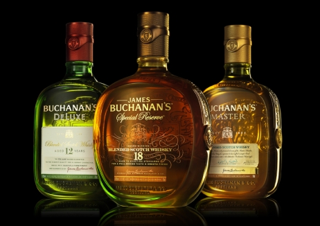
Diageo wanted a contemporary, elevated redesign of Buchanan’s brand, bottles and secondary packaging to reflect its premium quality and justify the expensive price point.
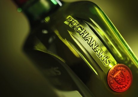
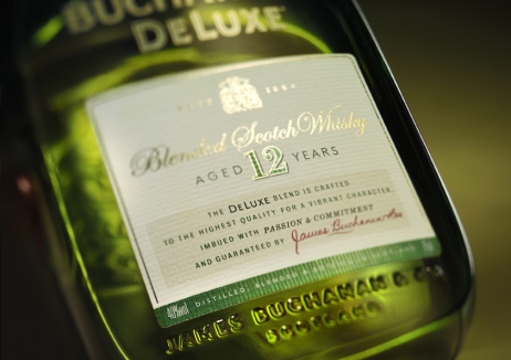
Drawing on its strong history, the new bottle design features James Buchanan’s signature and an embossed family crest, which delivers a thoroughly modern expression for the range.
Buchanan’s has been rejuvenated. Just one year after the redesign it has seen a surge of brand value in its key Latin American markets - by 23% in Mexico and 52% in Colombia. And in the US – the brand’s largest market – value growth is up 9%. Buchanan’s overall brand value increased by 20% and it has successfully entered new markets and driven further penetration.
发布于2019-12-23
设计师
forceMAJEURE Design
设计奖项
英国DBA设计奖
Gold/金奖
2017 年
颜色


