1/2
The Pride of Laotian Success
Beerlao has dominated the Laos beer market since 1973. But when it launched Beerlao Gold to compete against premium brands Heineken and Tiger, it found customers were unwilling to pay a higher price than their already beloved Beerlao.
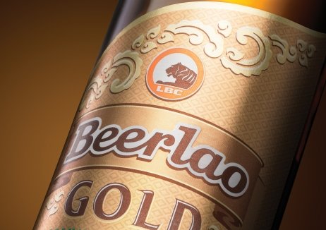
To connect with consumers, the packaging was redesigned in a way that repositioned Beerlao Gold as a symbol of Laotian success. The original product story was replaced with a focus on Khao Kai Noy, one of Laos’ most precious rice varieties. New graphics were created with the help of a local art teacher, while the iconic Beerlao orange was used on the bottle’s neck as a mark of reassurance and pride. A gold palette reflected the Laotian consumer’s favourite things – silk, premium whisky and jewellery.
The rebrand in February 2014 resulted in an impressive 883% surge in annual sales growth and surpassed the Feb-May 2014 sales target by 135%. It even allowed for a $5USD increase in price per case.
发布于2019-12-23
设计师
Design Bridge
设计奖项
英国DBA设计奖
Bronze/铜奖
2015 年
颜色


