1/2
Frylight Redesign
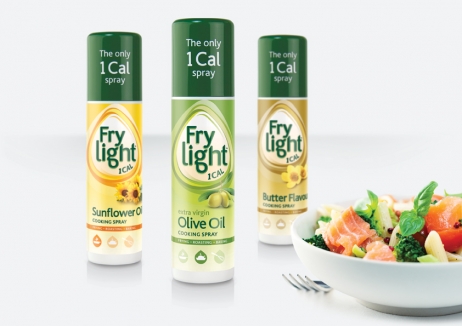
In a category where consumers are prone to defaulting to the product with the best price, cooking oil brand Fry Light was finding that despite their unique spray format, 80% of consumers were only buying their product once. The decision was taken to reinvigorate the brand and pack design to deliver a healthier look and feel to appeal to a wider range of consumers beyond dieters.
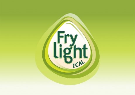
The new modernised, simplified and impactful design with a logo that mimics a droplet of oil, has driven brand value up by £22.6m, generating a 18.6% increase and is achieving a 26.7% increase in unit sales. Volume sales have grown from 5.5million to 10.7million units and the brand is now the UK's No1 choice in the category, holding the second highest repeat purchase rate. In the last year, the new look attracted nearly 4.4million buyers and has allowed the brand to increase the price point by 31.5%.
发布于2019-12-23
设计师
BrandOpus
设计奖项
英国DBA设计奖
Gold/金奖
2016 年
颜色


