1/5
The Less-is-More Mobile Phone
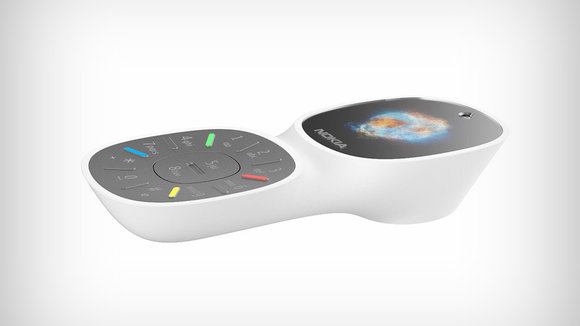
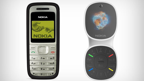
I know I’m not the only one who feels like they can’t keep up with my smartphone’s fancy features! Remember the good ol’ days when your phone was just a phone?! From the lead designer of the Nokia 1200 comes another phone that looks back to basics… well, sorta.
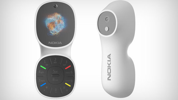
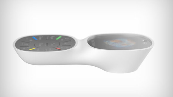
This stripped-down, phone may look as minimalist as its candybar-style predecessors, but it actually looks to artificial intelligence to manage tasks. As you would with Google Home or Amazon’s Alexa, you can speak directly to the device for almost any interaction. Its compact screen is just big enough to display any required information. Now, if only it had that snake game!
Designer: Xiaoxi Shi / 2-LA Design
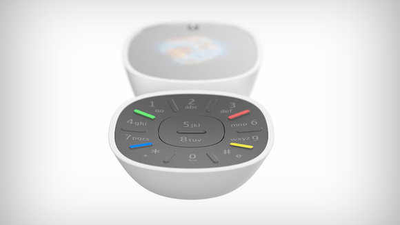
“Keypad can be used for more intuitive interaction and blind typing, 4 colored small keys are quick access to designate functions,” Designer Xiaoxi Shi told YD.
“Recognizable microphone/speaker details in top is for great voice input and output experience which we believe will be core of future interaction,” said Shi.
发布于2019-02-27
设计师
Xiaoxi Shi / 2-LA Design
颜色
相关推荐
